BorrowCircle - Design System & UI
Built a full design system for a community lending app, with every colour pairing passing WCAG AA.
Overview
Designed my own final prototype and built its full design system
Borrow from your neighbours, not the store
BorrowCircle is a community lending app: neighbours list the tools and equipment they rarely use, and people nearby can borrow them. Our team of 3 did the research and testing together, and then each of us designed and finished our own final prototype. This one is mine.
- !The problem Lots of things, like a lawnmower or a ladder, are only needed now and then. Buying one is expensive, and asking a neighbour you've never met feels awkward.
- Why it matters Lending only works if both sides trust it: borrowers need to know what they're getting into, and lenders need to feel safe sharing.
- +The solution A lending app built on a structured design system, with accessibility designed in from the start.
Result
Designed my own final prototype and its design system
BorrowCircle, finished
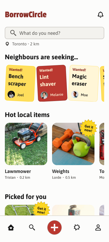
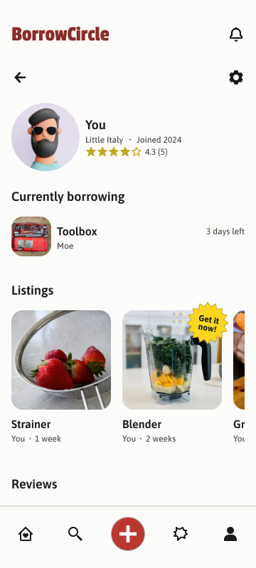
Here's my final prototype. Its look borrows from Honest Ed's, the famous Toronto discount store: hand-lettered "Wanted!" signs and yellow "Get it now!" starbursts, kept calm by a quiet palette, clear type, and consistent spacing. Every screen is built from the same design system, so borrowing and lending feel like one app, not two.
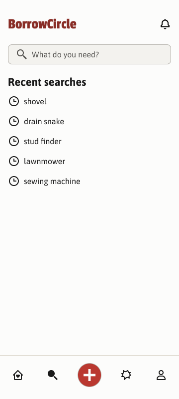
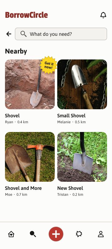
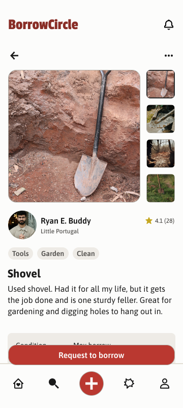
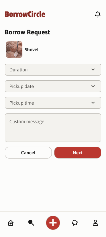
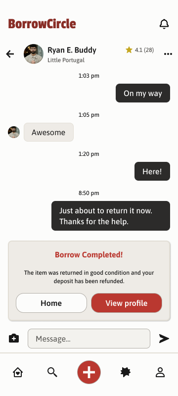
Borrowing, from search to message
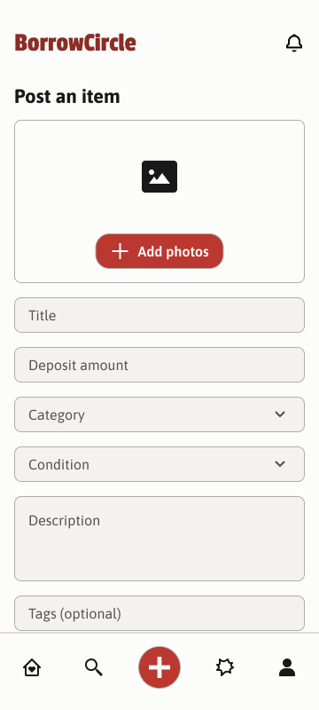
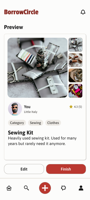
Lending, in a few taps
What came out of it
- 3-tier tokens, 22 component sets, 72 variants Built in Figma with variables, components, variants, states, and auto layout, so every screen follows the same rules and dimensions.
- WCAG AA on all 19 colour pairings All 19 text and background pairings meet AA, and 12 of them reach AAA.
- Four changes, each backed by testing Reviews, transaction details, borrowing status, and availability tags were all reworked from what participants and peer designers told us.
The process
How I got there
Research
Two neighbours, two sides of a loan
We started with a scenario. Bill has just moved to the suburbs, and his family is coming for dinner. His yard is overgrown, he can't afford a lawnmower yet, and he hasn't met any neighbours he could ask.
From there, we wrote proto-personas for both sides of a loan:
- Bill, the borrower A remote software developer on a budget. Comfortable online, nervous face to face. "I'm a little nervous making an introduction."
- Janine, the lender A community-minded grandmother whose house is full of equipment from years past. "We have all this junk that we only ever use every couple years!"
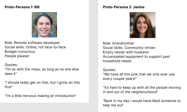
The takeaway Bill doesn't just need a lawnmower. He needs a low-pressure way to ask a stranger for one. And Janine wants a way to help that doesn't depend on already knowing everyone on her street.
Task Flows
Mapping both journeys
Each persona got a core task: Bill borrows a nearby lawnmower on short notice, and Janine lists her lawn equipment for the community. We mapped both as task flows before designing any screens.
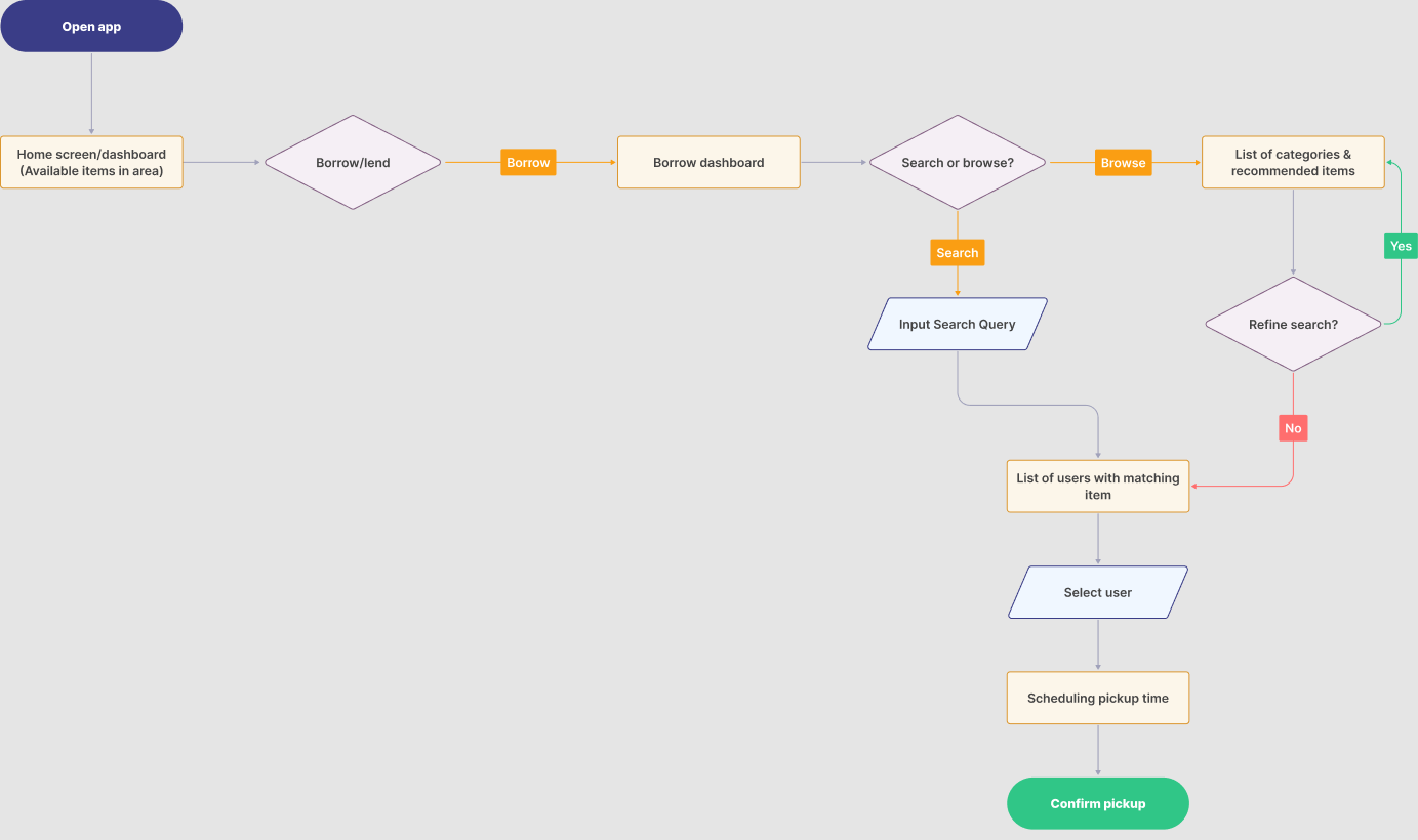
Bill's flow: choose Borrow, search or browse, pick a neighbour with the item, then schedule and confirm a pickup.
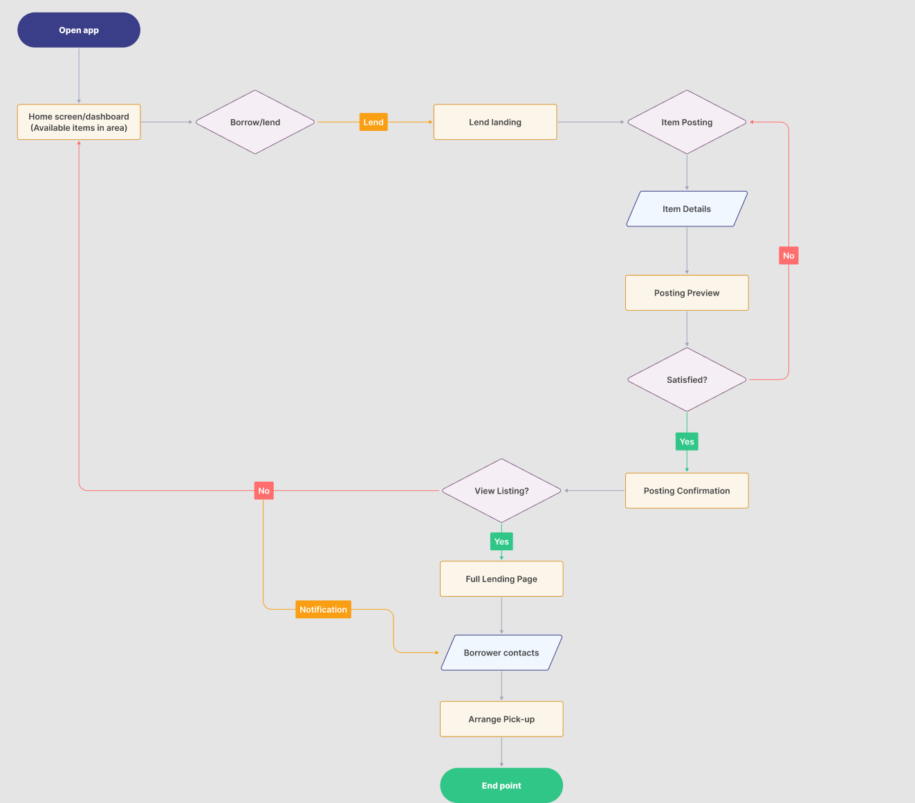
Janine's flow: choose Lend, add the item's details, preview and post it, then arrange pickup with the borrower.
Design System
Built the full token and component system
Tokens first, then components
Instead of designing screen by screen, I started with the system underneath:
- Three tiers of tokens Every colour, size, and space value is defined once and reused everywhere
- 22 component sets Buttons, cards, inputs, navigation, and more, each with its own variants and states
- 72 variants Every state a component can be in, so nothing has to be improvised later
- Auto layout everywhere Consistent spacing and dimensions, so screens stay tidy as content changes
A nod to Honest Ed's, with restraint
My earlier visual pass leaned harder into Honest Ed's loud signage. For the final version, I kept that personality only where it carries meaning: colourful "Wanted!" signs for what neighbours are looking for, and a "Get it now!" starburst for items you can borrow today. Everything else stays quiet, with a warm off-white background, one red for actions, Passion One for the wordmark, and Asap for everything you read.
Accessibility
Documented contrast for every colour pairing
Accessible by default
Accessibility was part of the system from the start, not a check at the end:
- Colour contrast All 19 text and background pairings meet WCAG AA, and 12 reach AAA
- Touch targets Sized so every button is easy to tap
- Alt text Written for every meaningful image
- Heading structure A clear H1, H2, H3 order so screen readers can navigate the page
Testing
Moderated 2 of our 6 remote sessions
Testing with people who already use marketplaces
We recruited 6 participants with a screener. Everyone had to be 18 or older, use digital platforms to make social connections, and have used marketplace apps like Facebook Marketplace, Craigslist, or Kijiji. That way, we could see whether their habits from those apps carried over.
We ran the sessions over Microsoft Teams, and I moderated 2 of them. Each one combined four methods:
- 5-second test A quick look at the home screen: what do people think this app does?
- Think-aloud tasks Request to borrow a shovel from a neighbour, then list a heavily-used sewing kit with the right condition tags
- Follow-up interview What was hardest, what would have helped, and what people liked most
- System Usability Scale A standard questionnaire for an overall usability score
Success meant finishing each task with fewer than 2 backtracks or dead ends.
What we found
Participants liked the design and understood straight away that this was a community borrowing app. The layout borrowed familiar patterns from apps like Facebook Marketplace, so people rarely struggled to finish the tasks. But they moved fast, and that's where the problems were.
- +It felt familiar Participants grasped the app's purpose right away and found the flow intuitive
- !Trust was in question People checked reviews and profiles before agreeing to meet a stranger
- !The deposit got skimmed The deposit checkbox was required, but most people ticked it out of habit
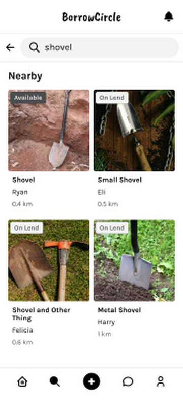
- !"On lend" read as unavailable People assumed they couldn't borrow those items at all
- !Condition labels felt vague People wanted the familiar options they knew from resale apps
- !Borrowing vs. messaging People expected to message the lender first, like on Facebook Marketplace
Participant 3, on the deposit "I kinda just skimmed everything […] I feel a lot of people do the same thing that I would and just check box because it's this force of habit."
That one worried me most. Money was changing hands, and a quick tick of a box meant a dishonest lender could set a high deposit and an inattentive borrower would agree to it.
Participant 3, on trust "I'd like double check who this Ryan E. Buddy is to make sure I wouldn't end up in a dumpster if I went to meet him like IRL."
Peer Review
A second set of eyes
Before testing, peer designers had critiqued the same prototype. Reading their notes next to the test findings, the same themes came up again:
- !No shared return date The item page showed the deposit, but not how long you could borrow it or when it was due back
- !Whose review is it? Reviews on an item page read like reviews of the item, not of the person lending it
- !Borrow, or chat? It wasn't clear that tapping "Borrow" would lead to a conversation with the lender
- !Safety needs an exit Meeting strangers calls for a way to report or block someone
The takeaway Both groups were really asking the same question: can I trust this person, and do I know exactly what I'm agreeing to?
Iterating
Turned the findings into four changes in my final prototype
Four changes, all about trust
Change 1 · Transaction clarity
A deposit you can't skim past
The deposit moved out of a checkbox at the bottom of the form and into its own confirmation, which people have to read and accept before the request goes through.
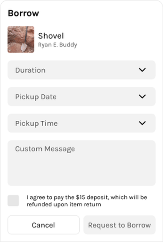
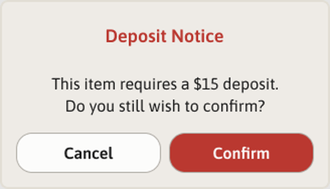
The item page now shows the condition, maximum borrowing time, pickup time, and pickup location up front, so borrowers know the terms before they ask.
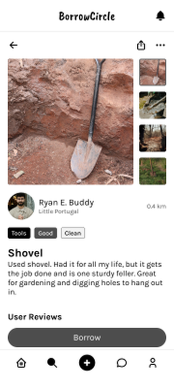
Change 2 · Trust through reviews
Reviews front and centre
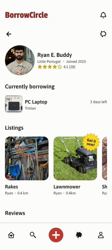
Reviews already existed, but they were easy to miss. Now profiles show the person's rating and reviews, separate from reviews of a single item.
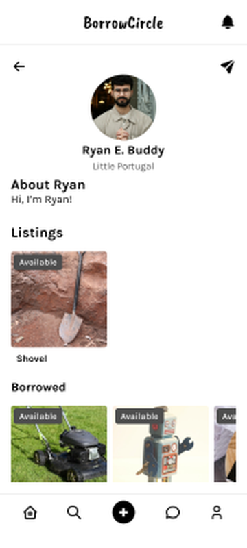
Change 3 · Borrowing status
Show what people are borrowing right now
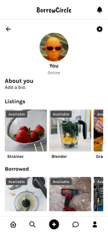
A borrowing history became a live "Currently borrowing" list, with days left on each item. Seeing that someone returns things on time is more convincing than a list of past loans.
Change 4 · Availability
Only flag what's free right now
"On lend" made people think an item was off-limits, when it was only borrowed for now. I dropped that tag. Only items you can borrow right away get a tag, which also makes the results calmer to scan. In the final style, that tag became a "Get it now!" starburst, straight out of Honest Ed's.
Reflection
What I learned
- A system pays off on the second screen Building tokens and components first felt slow at the start. After that, every new screen was faster and more consistent.
- Habits beat fine print A required checkbox still got skipped, because ticking boxes is automatic. If something really matters, like money, it needs its own moment.
- Accessibility is easier as a rule than a fix Checking contrast once, at the token level, meant every screen built from those tokens was covered.
- Design for both sides of the trade A lending app has two users with very different worries. Writing a persona for each kept us from designing only for the borrower.