CIUT - Audit & Website Redesign
A content audit and competitor-informed redesign to help people connect with U of T's campus radio station
Overview
Showing off a station with a good heart
CIUT 89.5 FM is U of T's campus and community radio station. It has a good heart, but its website wasn't showing it.
- !The problem Info on volunteering, donating, and even the shows themselves was missing, misplaced, or buried.
- Why it matters CIUT runs on donations and volunteers. If people can't find how to help, they can't help!
- +The solution An audit of every page, five ranked fixes, and a 12-page redesign built around the people who love the station.
Result
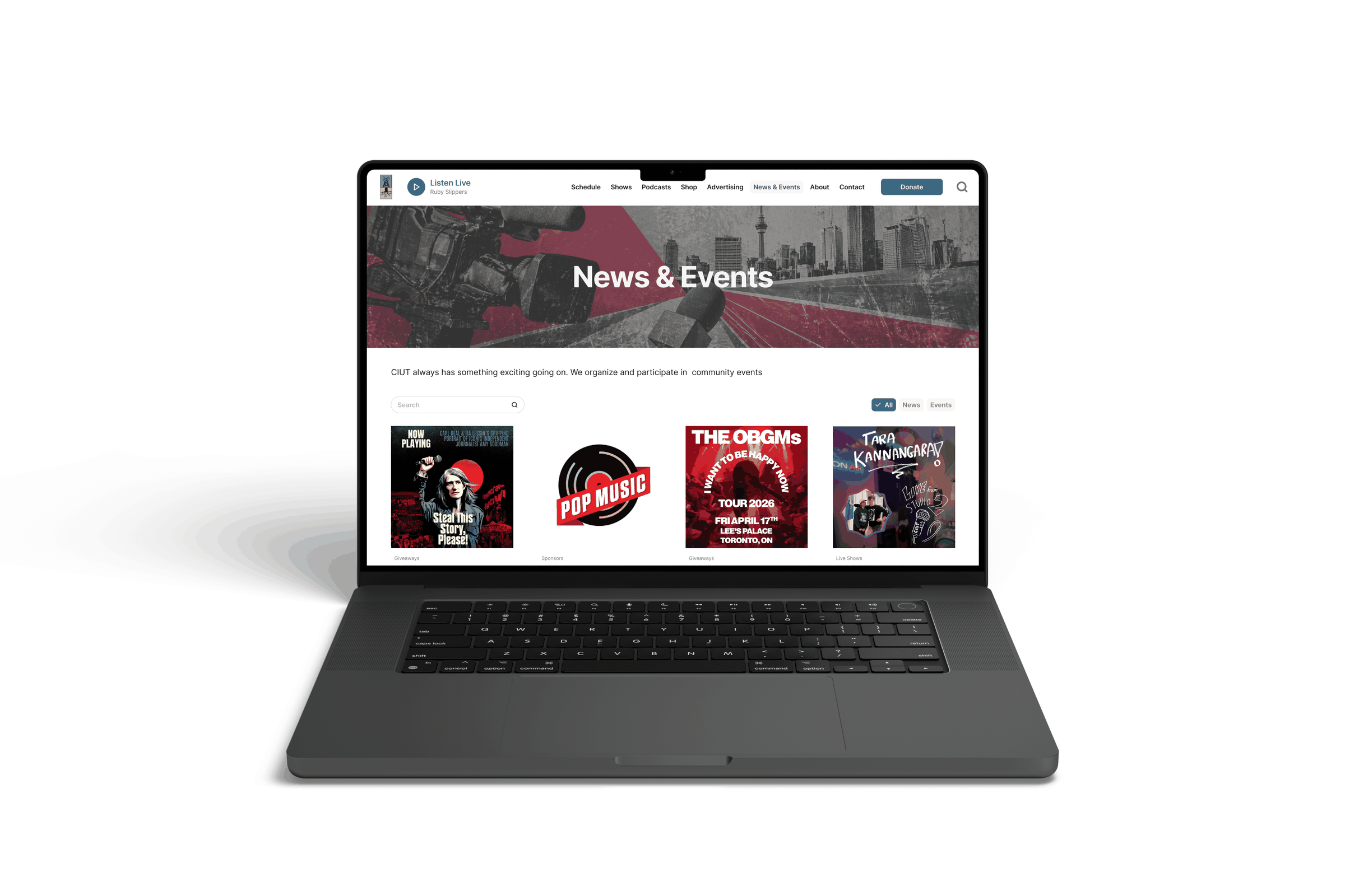
CIUT.fm, redesigned
Here's where it ended up. All 12 pages are clickable, so have a look around:
What came out of it
- Every problem, backed by data I crawled all 155 URLs and rated the content, so every fix points back to something real.
- A to-do list, ranked Five fixes, most important first, that a small volunteer team can actually work through.
- A redesign you can click Every fix shows up in the prototype, so it's shown, not just described.
The process
How I got there
Problem
I wanted to volunteer… but how?
CIUT runs on volunteers, so I was surprised that when I went looking to volunteer, the website barely mentioned it.
It didn't stop there. Info about the station and how to get involved was often missing, misplaced, or buried. For a nonprofit that runs on donations and volunteers, that's a big deal!
Problem Statement CIUT's listeners and community need a clear way to find the station's shows, events, and ways to help, so they can connect with it and support it.
Audit
Every page, rated
This started as a school assignment, but I picked CIUT because I actually care about it, and I took it way past what was asked.
 Phase 1: SEO crawl Screaming Frog pulled all 155 URLs: every page, image, link, and bit of metadata.
 Phase 2: Content audit I rated content from 1 to 5, including 10 of the 74 show pages in depth, on whether it was:
- Accurate
- Actionable
- Findable
- Relevant
- Usable
What I found
 !Lack of polish Broken show links, a COVID-19 notice still on the Advertising page, and a board list missing titles and emails
 !Missing context A donate button beside unexplained hat and T-shirt photos, and captionless photos site-wide
 !Stale content Most shows had active social media that the site rarely linked to, and the events CIUT runs were barely mentioned
 !Messy information 70 pages with no meta description, 76 sharing "Just another WordPress site", and headings out of order
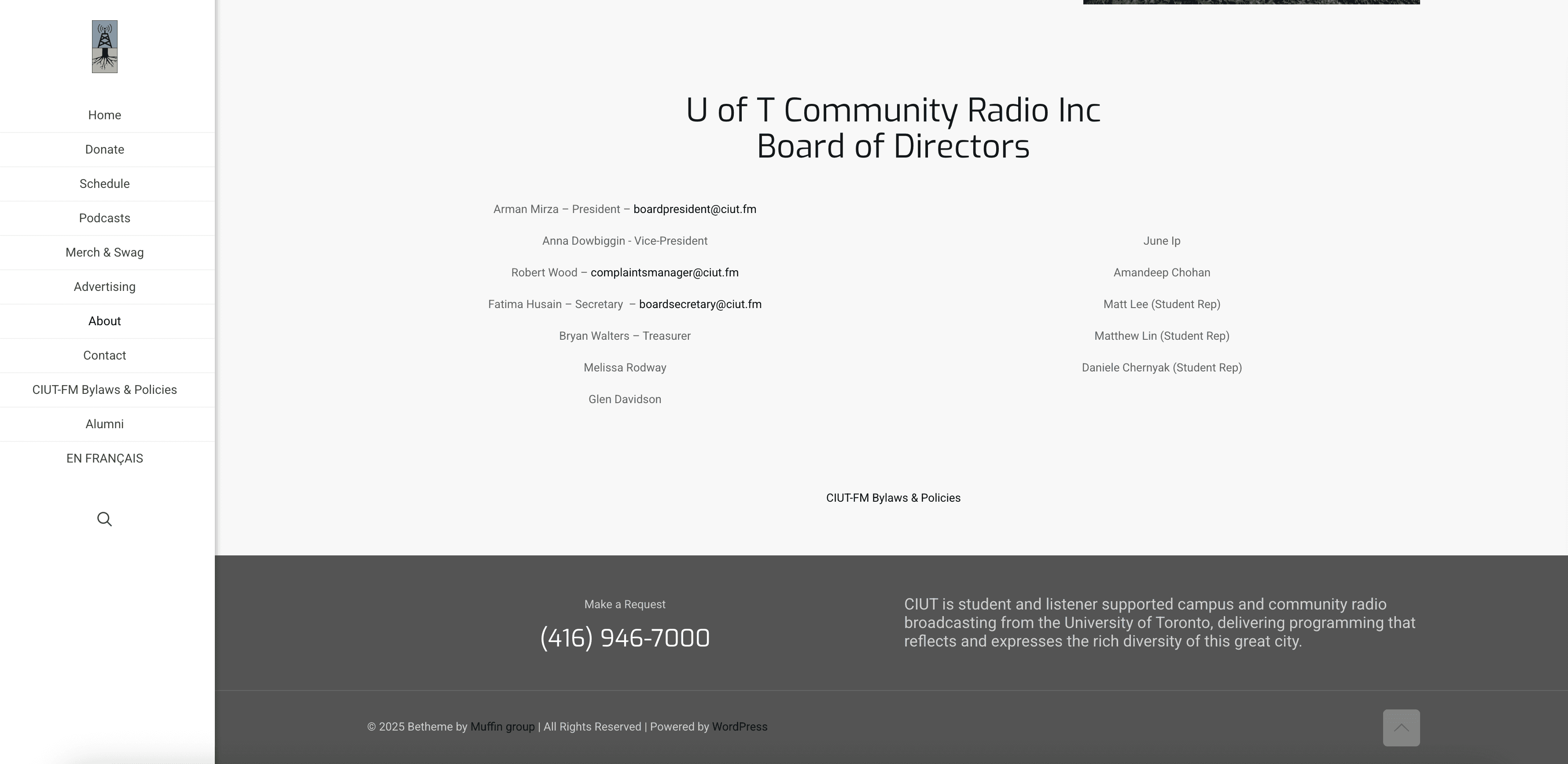
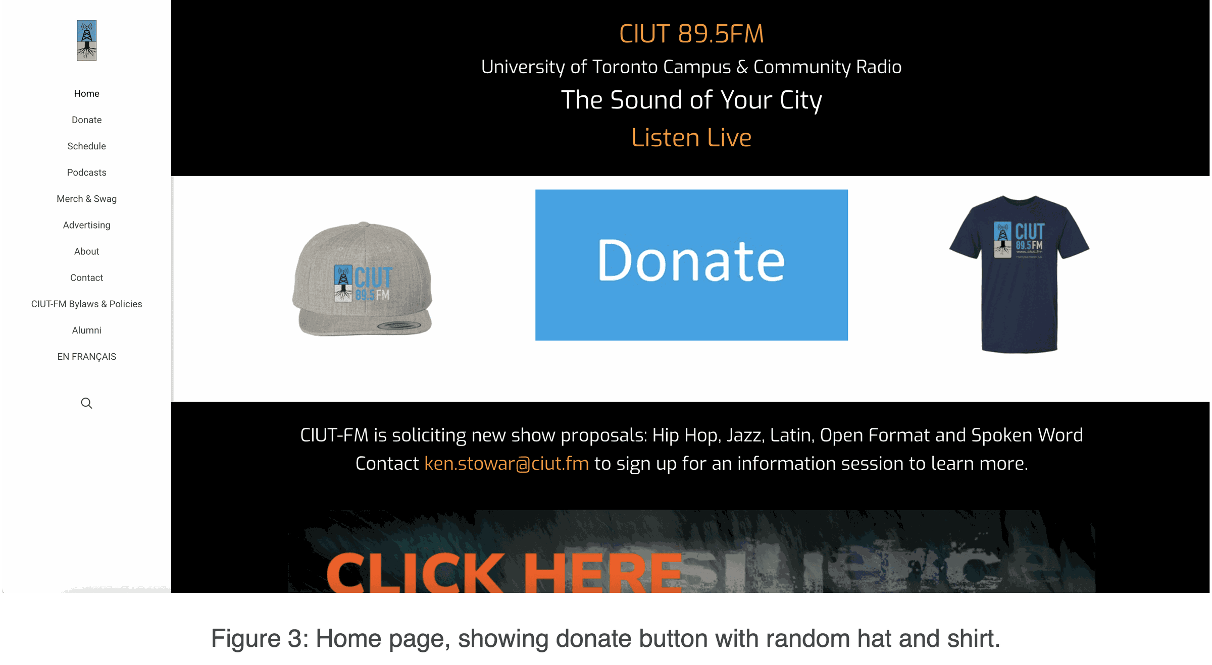
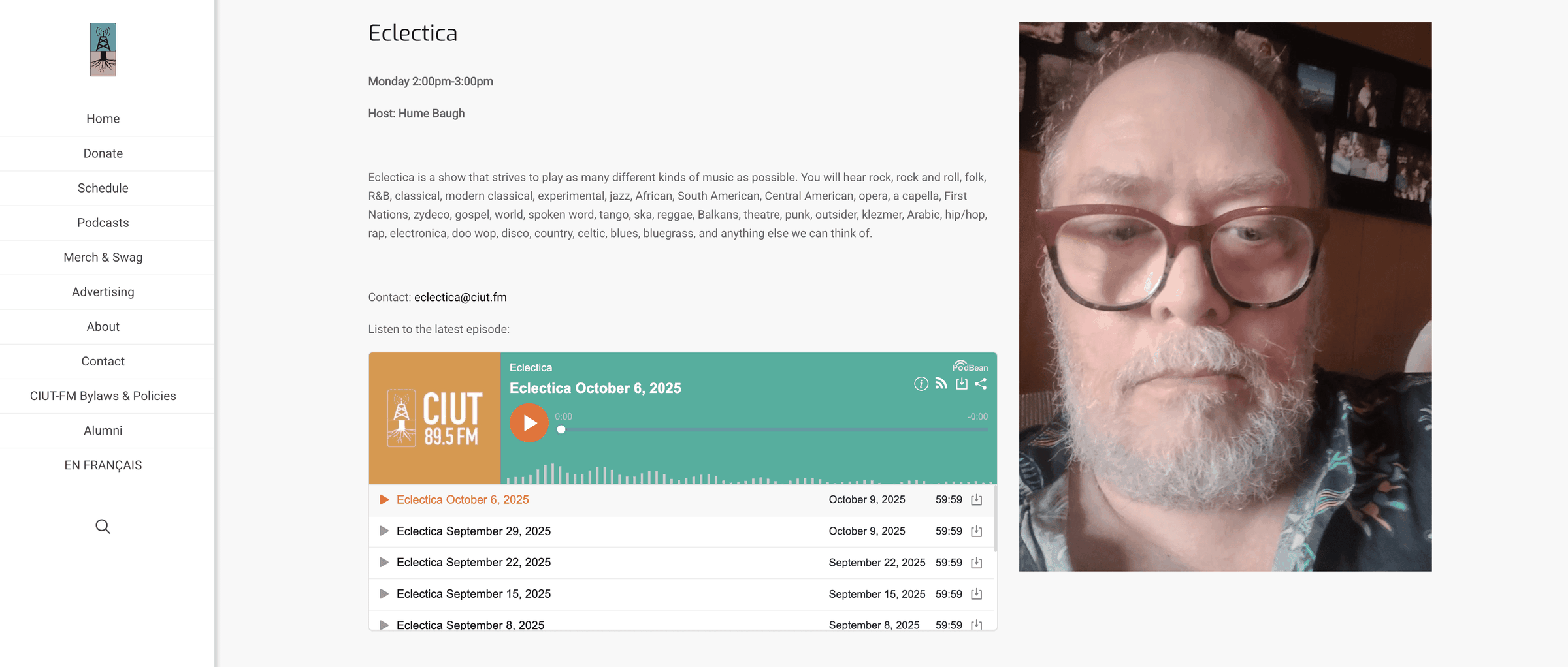
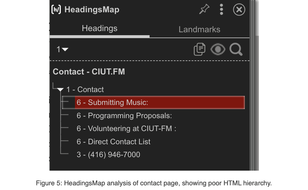
The takeaway Visitors had to work way too hard to piece things together, and so did search engines.
Fixes
Five fixes, most important first
Everything I found boiled down to five fixes. The rest of the project is me putting them into action.
- Fix what's broken or missing Every show and podcast gets its own page with a photo, description, and contact info
- Add context and clarity Every section and call to action explains what it is and why it matters
- Restructure for readability Short paragraphs, real subheadings, and consistent show pages
- Refine for SEO Unique titles and meta descriptions, and a proper heading hierarchy
- Link out Make the site the hub for shows' social media, CIUT's own accounts, and live events
Structure
How do other stations do it?
I looked at three stations with similar missions and more polished sites: CJTM (TMU), CKUT (McGill), and n10.as (Montreal). Here's what they had in common:
- +Always-there actions "Listen Live" and "Donate" live in a fixed header
- +Schedules vs. shows Calendar-style schedules, and separate photo grids of shows with filters
- +Show pages that invite Genre tags, external links, and easy access to past episodes
- +A home for events Dedicated News & Events pages, plus footers with address and socials
So I rebuilt the site around what listeners do
- Always one click away Listen Live and Donate sit in the header on every page
- Schedule and Shows, split "What's on now?" and "what's on CIUT?" each get a clear answer
- New homes for content Podcasts and News & Events get their own pages
- A tidier menu En Français, Alumni, and Bylaws move under About
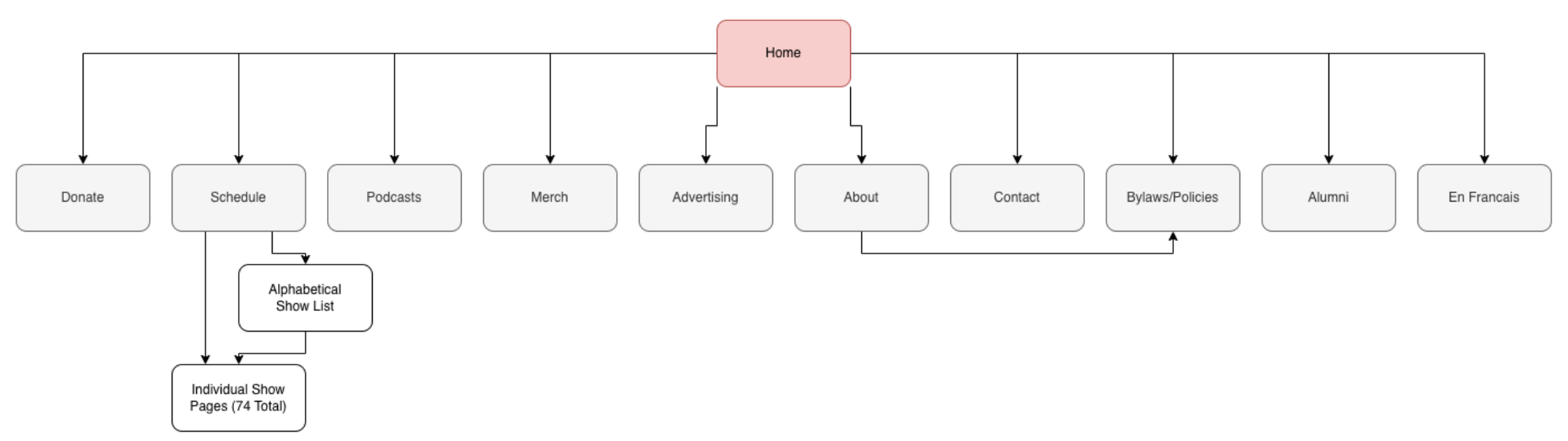
Before: a flat menu of ten sections, with shows only reachable through the schedule or an alphabetical list.
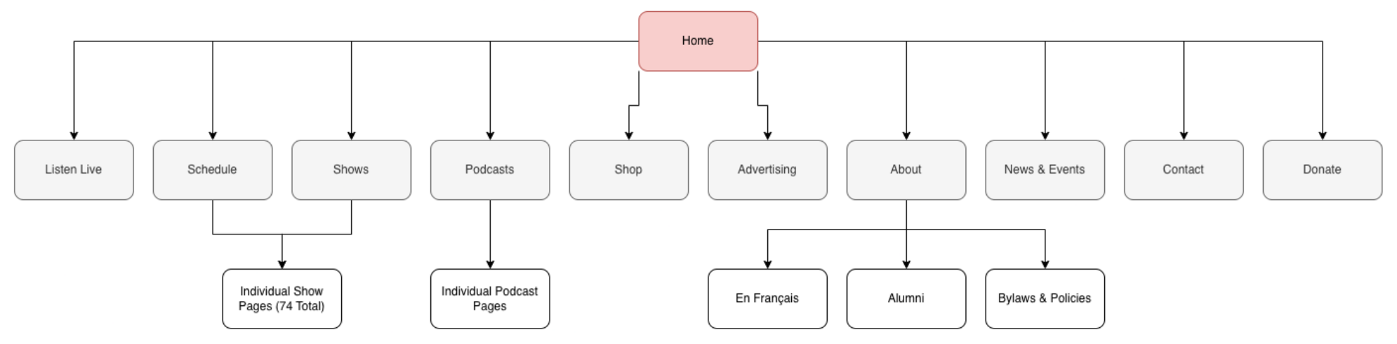
After: clear top-level sections, with individual show and podcast pages, and supporting pages grouped under About.
Redesign
The fixes, in action
Fix 2 · Add context
The mystery hat and T-shirt, explained
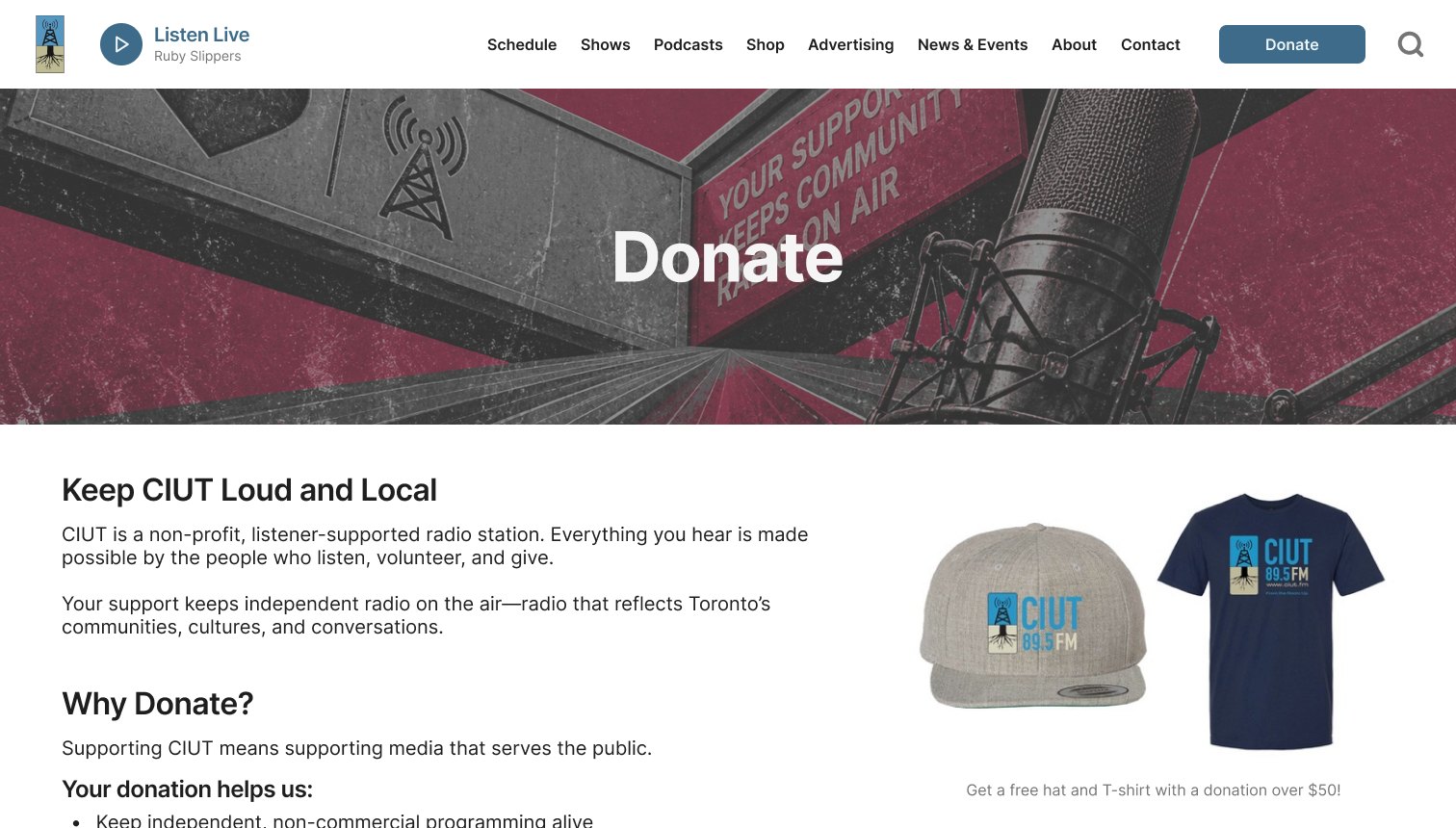
The hat and shirt are now clearly rewards ("free with a donation over $50"), and the page explains where donations go.
Fix 1 · Fix what's missing
Every show gets a real page
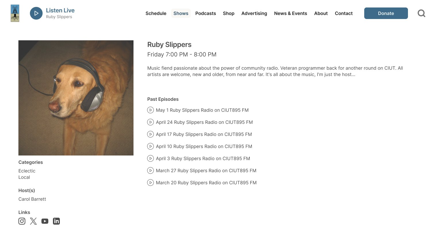
A consistent layout for every show: time slot, genres, hosts, social links, and past episodes to play.
Fix 1 + 3 · Missing info, restructured
Finally, who to email
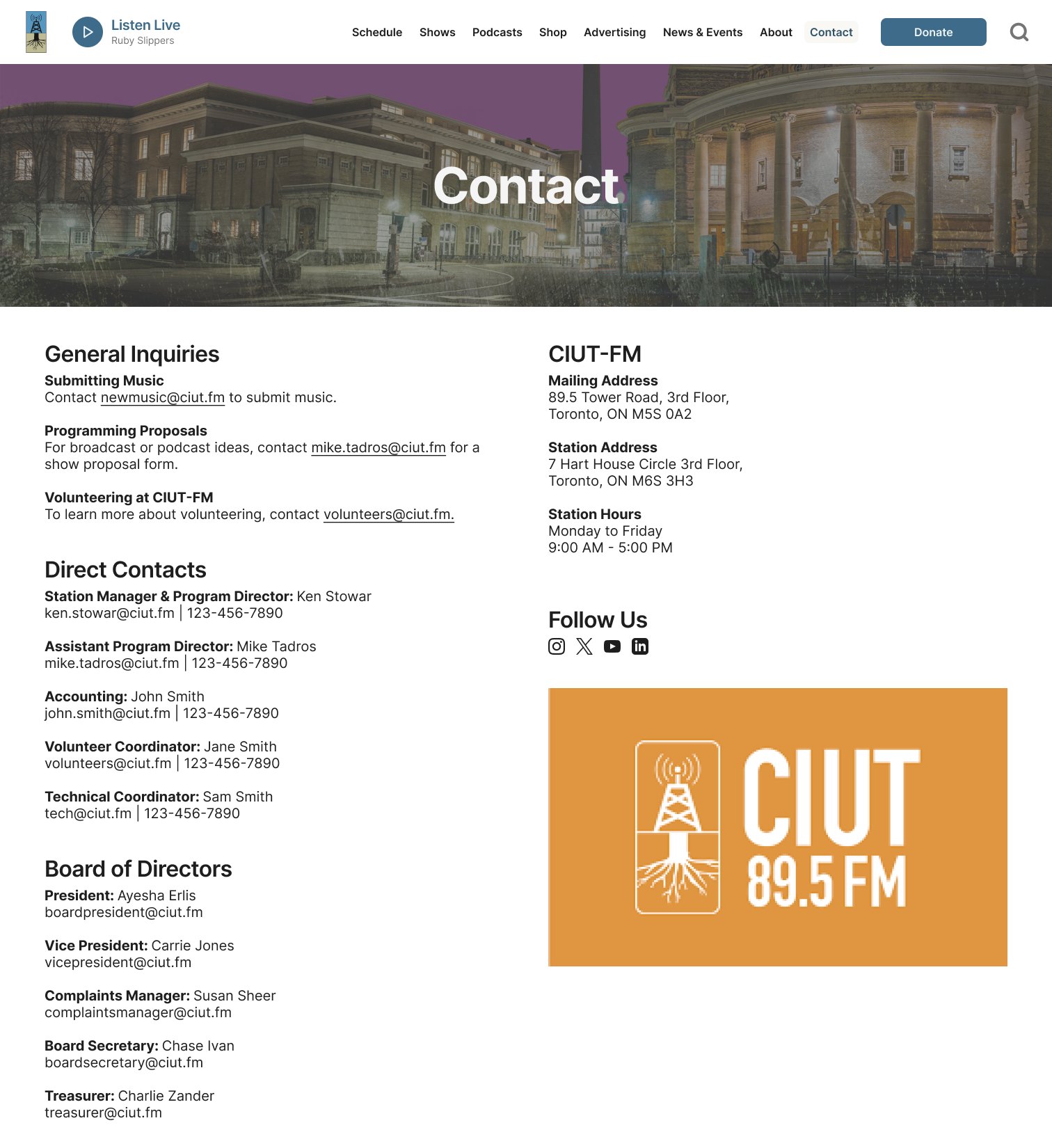
The board moved to Contact, and every person now has a title and email, alongside the station's address, hours, and socials.
Everywhere else
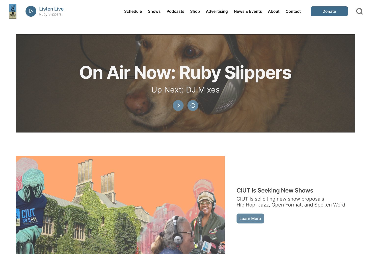
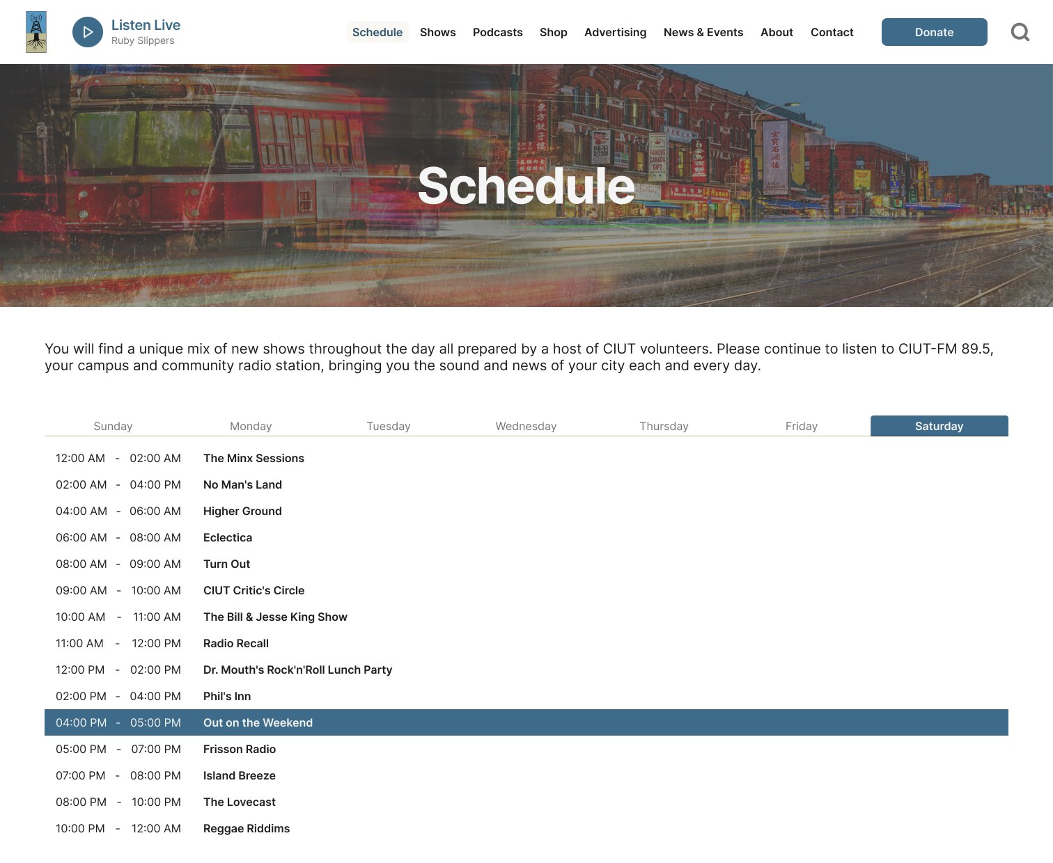
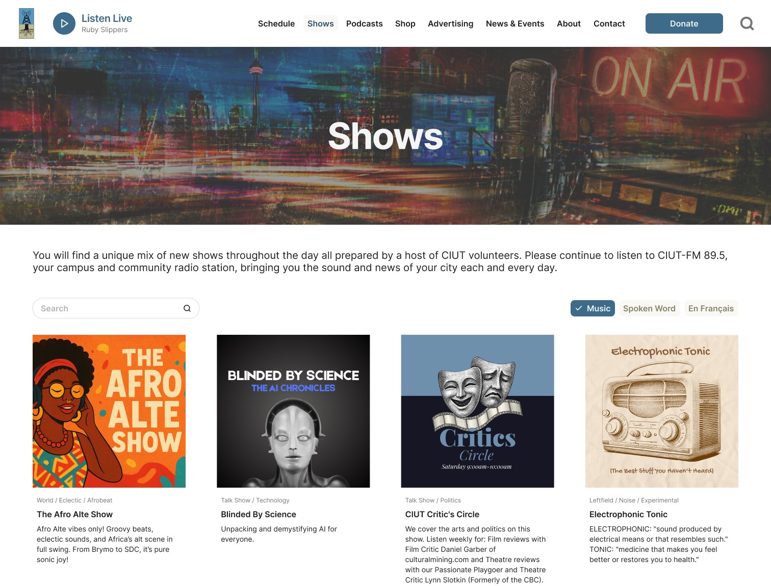
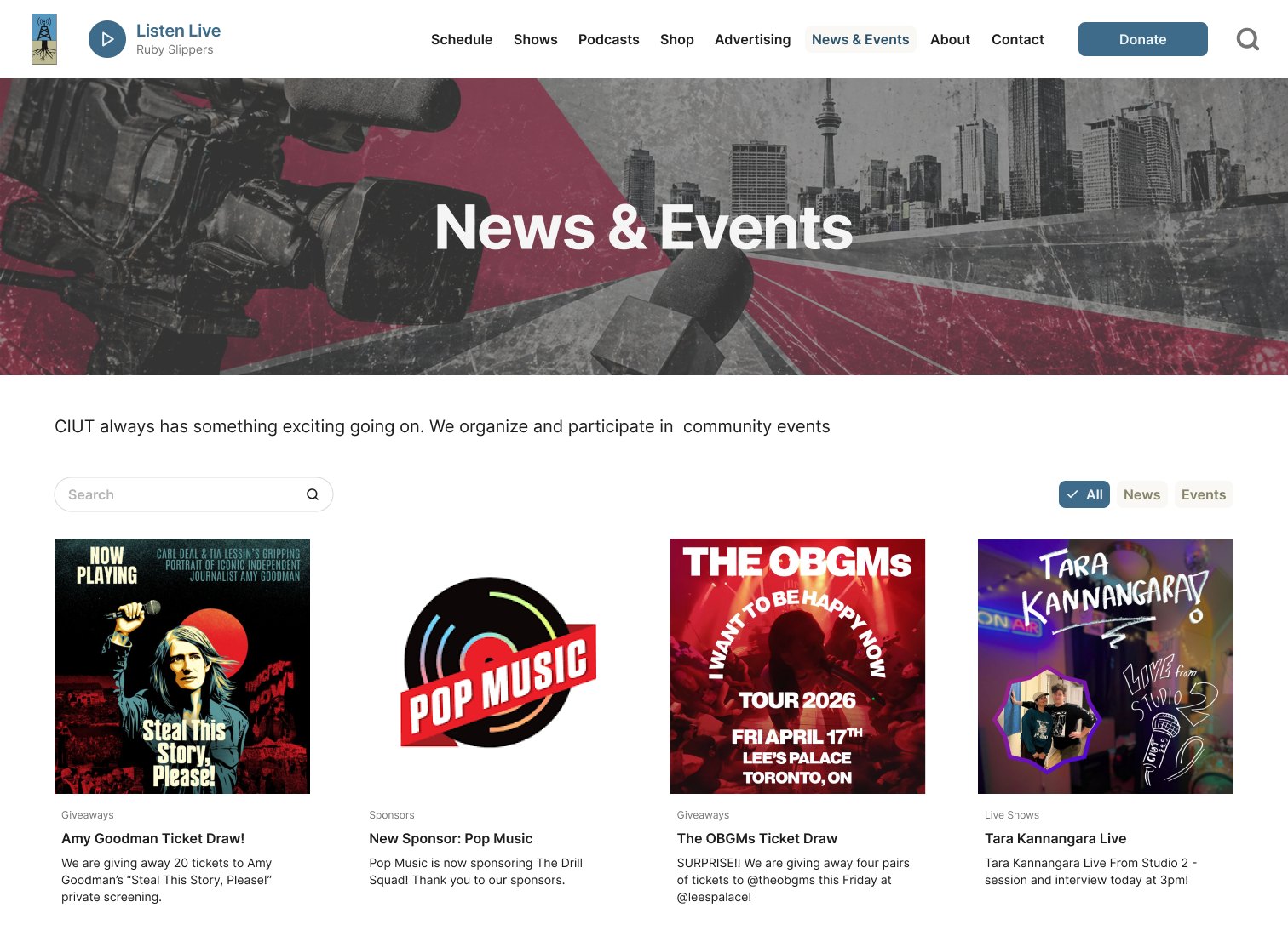
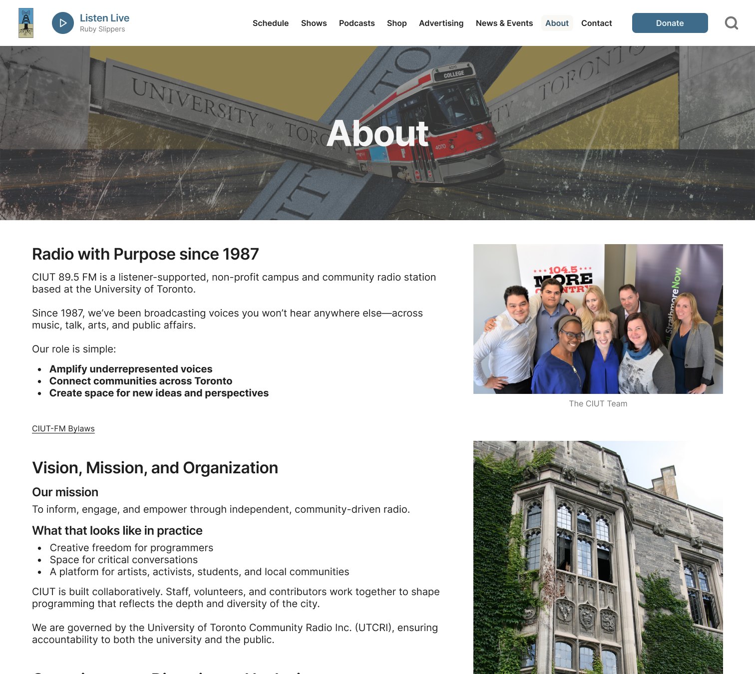
Reflection
What I learned
- A vague feeling can become a to-do list At first, I just knew the site felt hard to use. The audit turned that feeling into specific problems I could actually fix.
- Show it, don't just say it A peer reviewer suggested sticking to wireframes to save time. I prototyped every page instead. More work, but now you can click the fixes instead of reading about them.
- The work that matters most might be right in front of you We often dream about redesigning giant platforms. But CIUT runs on volunteers, with limited funding and not enough hands to catch everything. It felt so good to help people connect with an organization that's truly lovable.