SoundCloud - Usability Study
Led a usability study that found 4 high-severity issues in SoundCloud, each with a ranked fix.
Overview
Led a team of 5 from test plan to final report
How easy is SoundCloud for someone new?
SoundCloud mixes two worlds in one interface: a streaming app for listeners, and a home for artists to upload and promote their own music. We wanted to know how confidently new listeners, used to apps like Spotify, could find their way around it, and where they'd get stuck.
- !The problem New listeners bring habits from other streaming apps, and SoundCloud's mix of listener, artist, and social features doesn't always match them.
- Why it matters If new users can't find the features that make SoundCloud different, like commenting at a moment in a song, they have little reason to stay.
- +What we did A moderated usability study of SoundCloud's desktop site: 6 participants, 7 tasks, task success, the System Usability Scale, and product reaction cards.
Result
Reported 4 high-severity issues, ranked with a fix for each
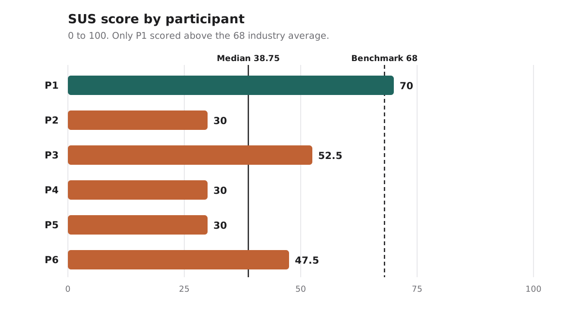
A median SUS of 38.75, against an average of 68
The System Usability Scale (SUS) gives a score from 0 to 100, and 68 is the industry average. SoundCloud's median in our study was 38.75. Three participants scored 30, and each of them had hit one of the high-severity issues below.
What came out of it
- 4 high-severity issues, each with a fix Playlists, content types, commenting, and genre search, ranked so the most damaging problems get fixed first.
- 3 strengths to protect Uploading, following, and timestamped comments all worked well and should survive any redesign.
- An explanation for the low score People still finished many tasks. They just had to work much harder than they should have, and the SUS score shows it.
The process
How we got there
Planning
Kept the plan, roles, and success criteria consistent
Seven tasks, each with clear success criteria
We wrote 7 tasks covering discovery, social features, organizing music, and uploading, and defined exactly what success looked like for each one before testing started.
- Search and like Find a dubstep remix of a Lana Del Rey song and like it
- Comment Find a song posted by someone you follow and leave a comment
- Genre search and follow Search for a genre and follow an artist you discover
- View liked songs View all the songs saved by the user PinkPantheress
- Create and share a playlist Make a playlist of 3 songs by different artists and send it to someone
- Upload (optional) Upload a rap song called "Jump" to reach the widest audience possible
- Monetize (optional) Find your options for making money from your songs
Every session had four roles: a moderator, a note-taker for task performance, a note-taker for the participant's experience, and a technician. We rotated them across sessions so everyone did every job.
Testing
Six in-person sessions, 30 minutes each
We ran the sessions on March 11 and 18, 2026, at the University of Toronto, on SoundCloud's desktop site in Chrome. Each one was recorded with screen, clicks, and audio, so we could check our notes afterwards.
- 5 minutes: Briefing Introduce the study and ask participants to think out loud
- 15 minutes: Tasks Up to 7 tasks, with the moderator reading each one
- 10 minutes: Wrap-up The SUS questionnaire, 3 to 5 product reaction cards, and 3 interview questions
Task Results
Logged success, partial success, and failure for every task
Where people got stuck
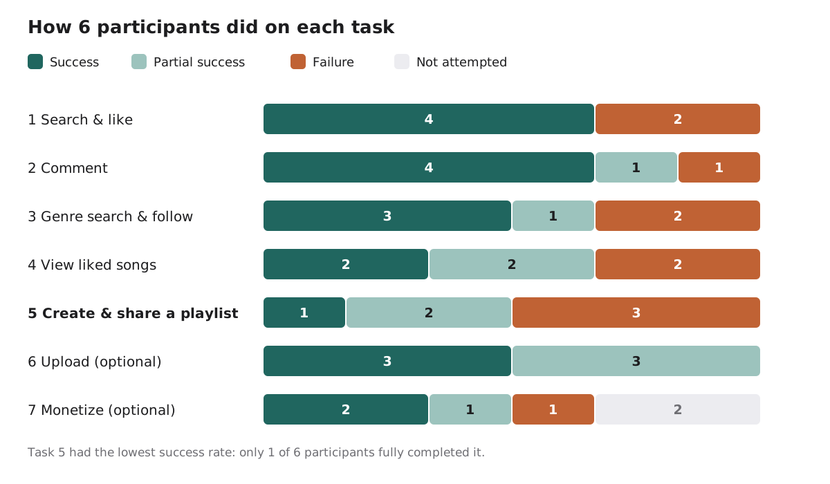
Creating and sharing a playlist was the hardest task by far. Uploading was the only task nobody failed, even though it was optional.
Findings
What worked, and what didn't
Issues were rated by severity: high severity meant the issue stopped people finishing a task or seriously confused them, and affected at least half of participants.
- +Uploading just works All 6 participants found the Upload button right away, with zero failures
- +Following feels familiar 5 of 6 found the follow button and their following list quickly
- +Timestamped comments delight Participants loved commenting on a specific moment in a song
- !Playlists start in the wrong place 4 of 6 participants struggled to create and manage playlists
- !Songs, albums, and playlists look the same 3 of 6 added a whole playlist when they meant to add one song
- !Comments are hard to find 5 of 6 had trouble finding the comment button or the comment box
- !There's no way to search by genre 4 of 6 struggled, and 2 couldn't finish the task at all
High severity · 4 of 6 participants
Playlists start in the wrong place
On Spotify and Apple Music, you make a playlist from your library. On SoundCloud, you have to open a song's three-dot menu and pick "Add to playlist" first.
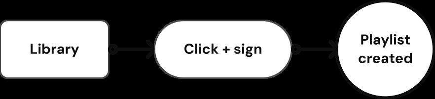
Expected: start from your library and tap +.

Actual: open a song, find its three-dot menu, and pick "Add to playlist" before you can create one.
Participant 5 "Am I dumb? It's not letting me make a new playlist."
High severity · 3 of 6 participants
Songs, albums, and playlists look the same
The home page shows songs, albums, and playlists on near-identical cards, with no label or icon. Worse, an album or playlist card previews its first song, so it looks exactly like that one song. Two participants tried to add what they thought was a single track to their playlist, and added an entire playlist instead. We hadn't predicted it either, so in the moment, even we weren't sure what had happened.
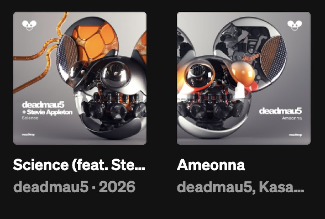
Participant 5 "It just saved all of the songs that were there into this playlist. I only wanted Conan Gray."
High severity · 5 of 6 participants
Comments are hard to find
The comment icon is small, sits apart from the like and repost buttons, and disappears entirely on songs nobody has commented on yet. Once people found it, the comment box on the next page looked nothing like it.
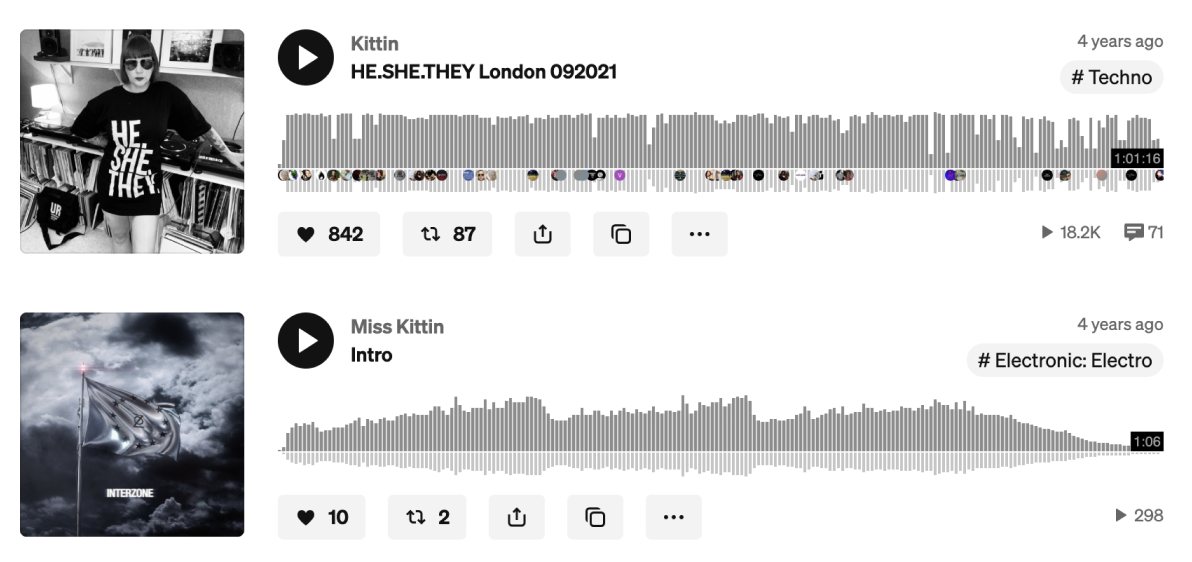
The comment count sits alone on the far right, and the second track has no comment icon at all.

The comment box on a song's page looks nothing like the icon that led there.
That's a real loss, because timestamped comments were one of the features participants liked most, and nothing like them exists on Spotify or Apple Music.
High severity · 4 of 6 participants
There's no way to search by genre
Search results can be filtered by type, but not by genre. Participants who succeeded used keyword searches, which gave inconsistent results. One participant spent the whole task looking for a genre list before giving up.
Participant 6 "On the filter section to the left of the screen, there is no filter by genre."
How it felt
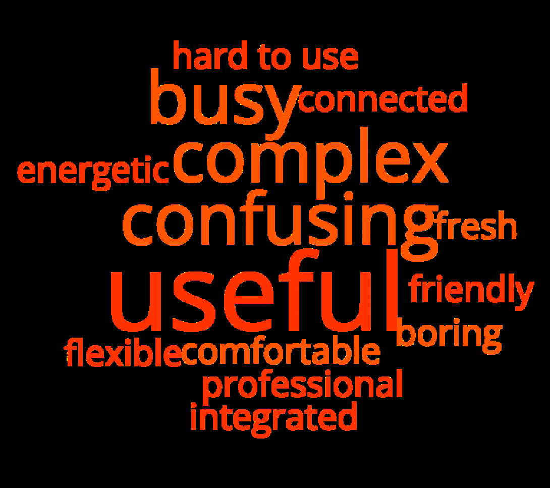
"Useful" was the most popular reaction card, picked by 3 participants. Right behind it were "busy", "complex", and "confusing", each picked by 2. In other words: the features people want are there, but they're too hard to find.
Recommendations
Four fixes, most important first
- Make playlists easy to create Add a "Create playlist" button to the library and playlist pages, and offer "Add to playlist" the same way on every type of content
- Label every content type Give songs, albums, and playlists their own labels or icons so they're easy to tell apart
- Make comments visible everywhere Make the comment icon bigger, group it with like and repost, and show it on every track
- Add genre filters Let people refine search results by genre and tag
Reflection
What I learned
- I was a poor stand-in for a new user I've used SoundCloud for years and always found it intuitive, so the low SUS score surprised me most of all. Our participants came with habits from Spotify and Apple Music, and SoundCloud didn't match them. Knowing a product well can hide exactly what makes it hard to learn.
- A low score doesn't mean nobody finished Most participants completed most tasks. The SUS score showed what task success alone couldn't: how hard they had to work to get there.
- Strengths are findings too Reporting what worked, like uploading and following, tells a team what not to break while they fix everything else.
- Know what your sample can't tell you Our participants were 6 graduate students from one course, all using the free desktop site. That's right for a first round of testing, but the next step is testing on mobile, with paid accounts, and with a wider range of people.