YumGo - UX Case Study
A food discovery app that gives tourists comfort in the unfamiliar. I led a team of 4!
Overview
Comfort in the unfamiliar
YumGo is a food discovery app for tourists. When you're somewhere new, with dietary needs or a certain vibe in mind, it helps you find a place that feels right.
- !The problem Finding somewhere to eat on a trip means bouncing between apps, with missing menus and info you can't trust.
- Why it matters Being somewhere new is half the fun of travelling, until you're tired, juggling a group, and hunger hits.
- +The solution One app for the whole journey, from discovering to dining, so you know what to expect before you walk in.
Result
YumGo (Taylor's Version)
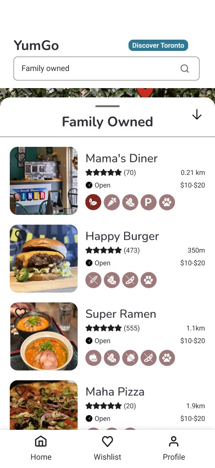
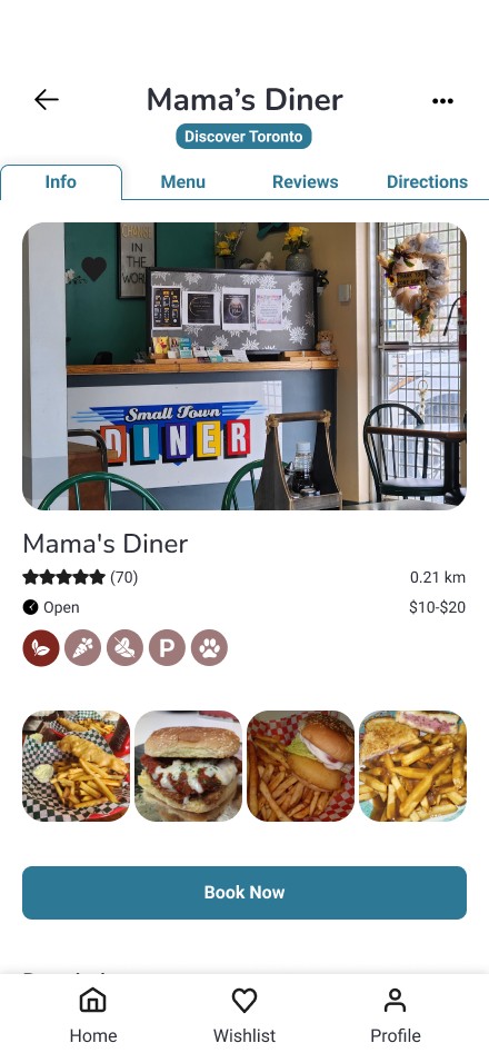
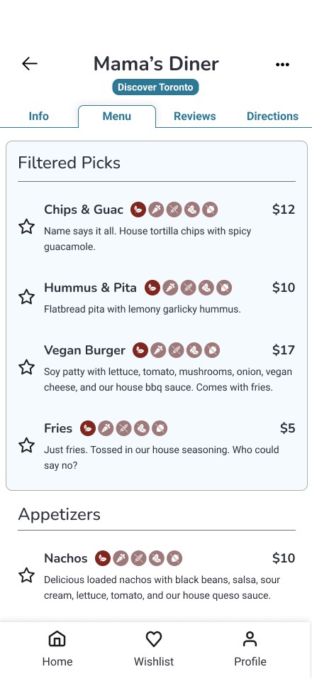
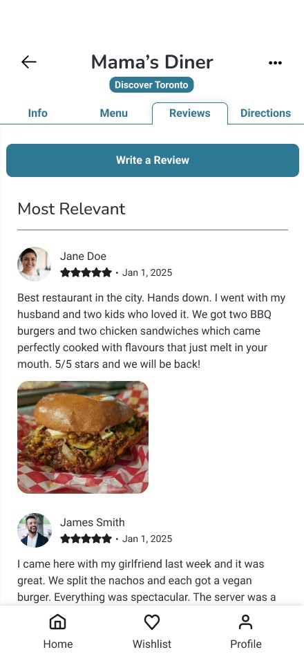
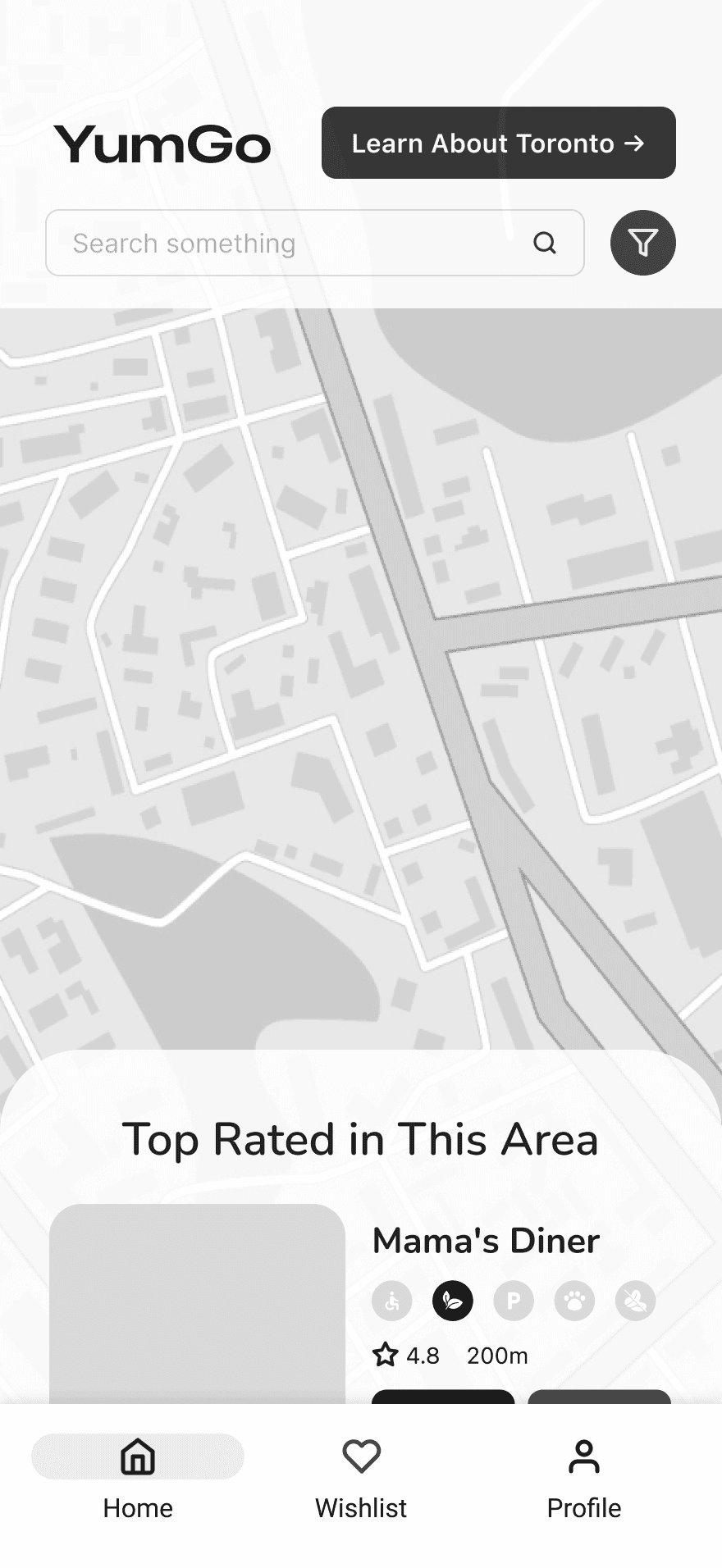
My own take on the final design: the fun of travelling, the comfort of apps you already know, and real photos to ground you. Try it yourself!
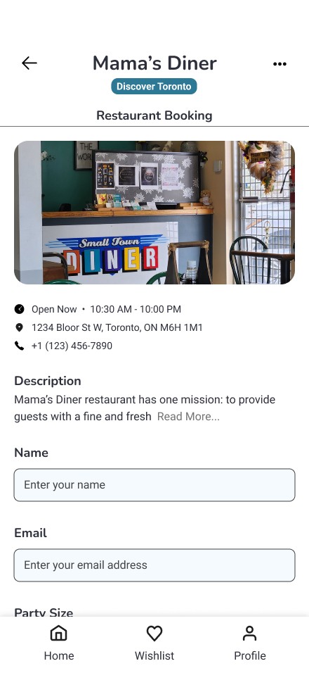
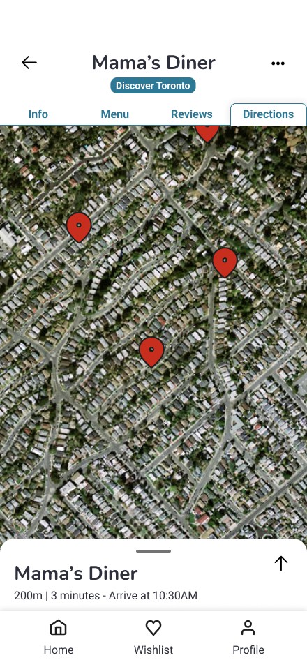
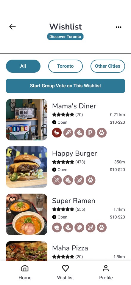
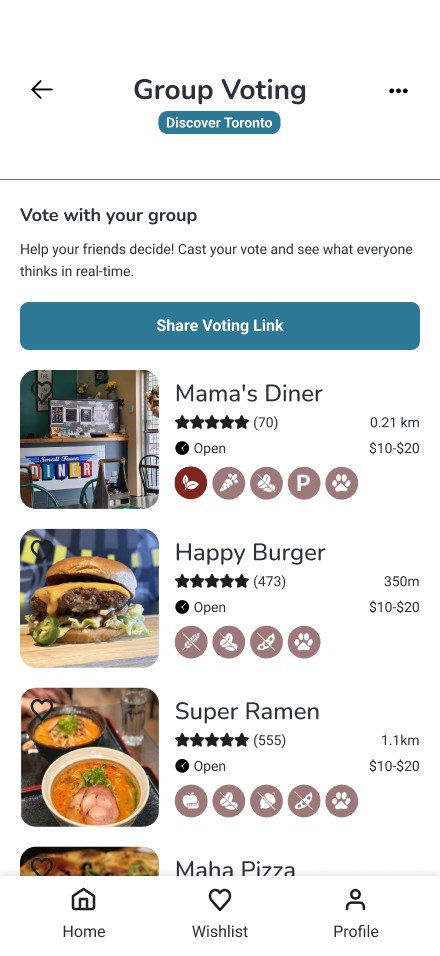
The full journey, from discovering to dining
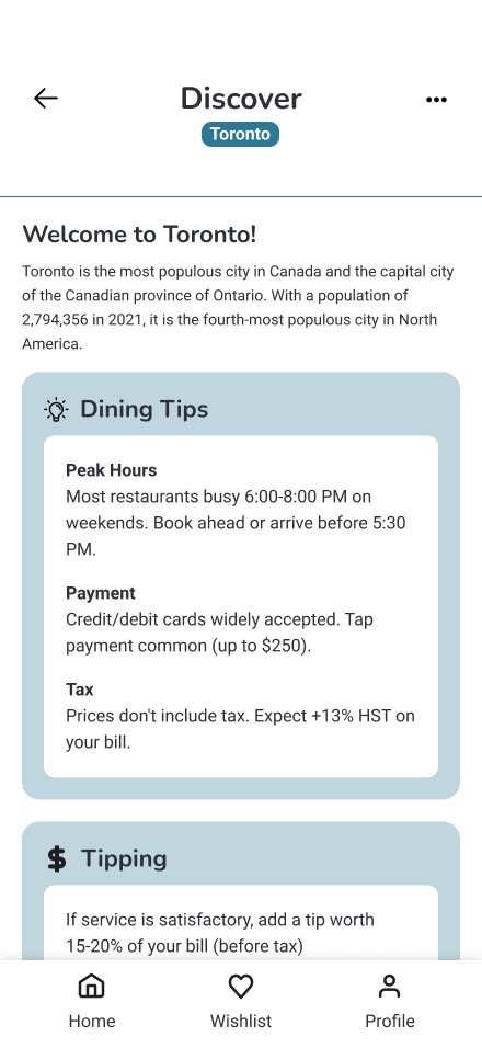
What came out of it
- One app, discover to dine Search, menus, reviews, booking, and directions, all in one place.
- Built on real people 8 interviews and 8 usability tests shaped what made it in.
- Four designers, one app I led a team of 4 from research to prototype, and kept it feeling like one app.
The process
How we got there
Problem
Eating while travelling should be good and easy. No ifs, ands, or buts.
Being somewhere unfamiliar is half the fun of travelling. It's all fun and games, until you're tired, short on time, juggling a group… and then hunger hits.
Now you're bouncing between apps to find the info you actually care about. Where do you even start?
Problem Statement Tourists need one personalized place to discover and book restaurants, so that eating somewhere new feels easy and memorable.
Secondary research
We (wrongfully) assumed it was all about time
We thought tourists wanted food ASAP so they could get back to sightseeing. Early research said otherwise: wait times barely came up.
 !Missing information Incomplete business and menu info
 !Weak discovery & booking Apps didn't support the full journey
 !Irrelevant content Full of noise and unwanted results
 +Desire for authenticity! Tourists wanted local, quality meals
The takeaway So I convinced my team to pivot: less about speed, more about authentic experiences that current apps weren't supporting.
Interviews
Travellers wanted to dine with certainty
We ran eight interviews with recent tourists about travel, food, and the apps they use for it. I moderated two and took notes on two more.
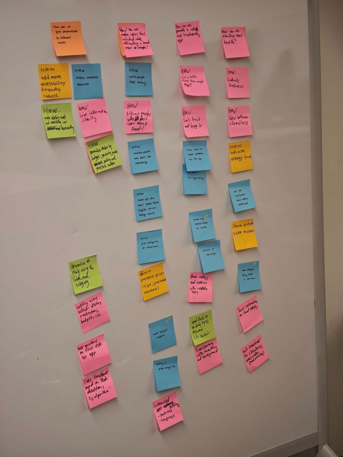
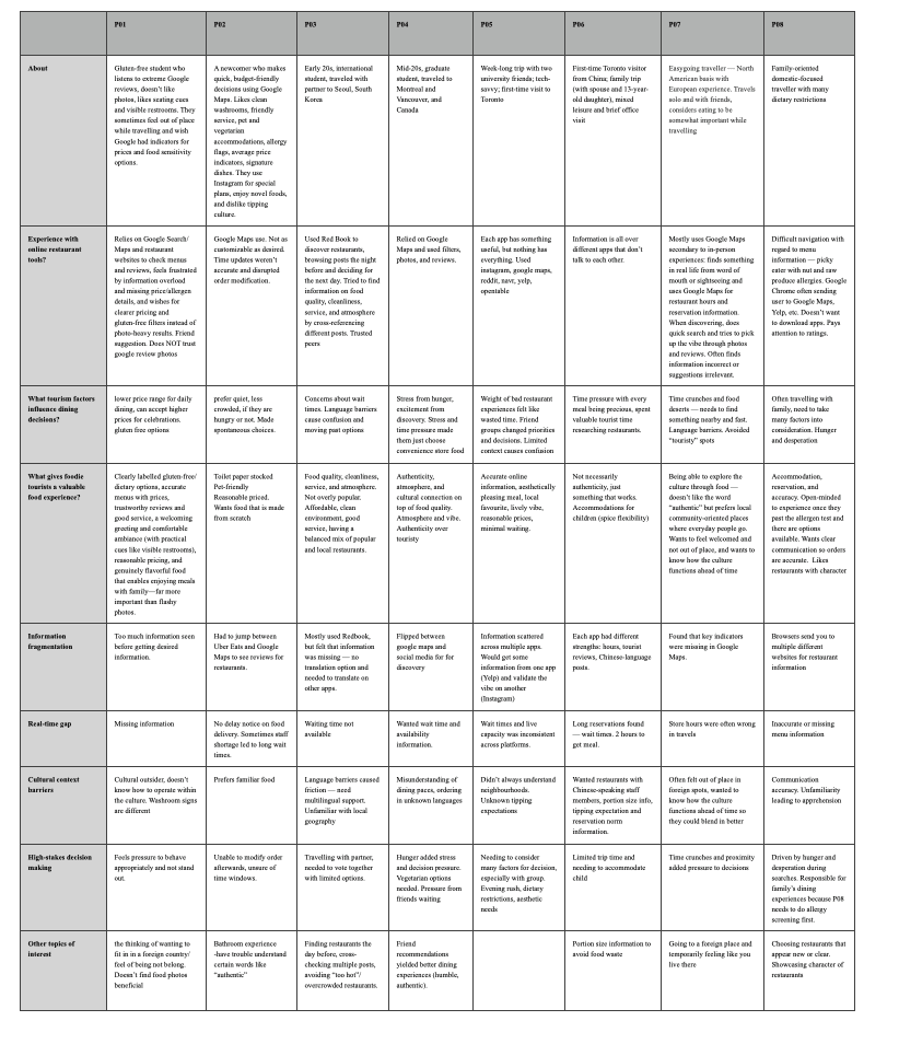
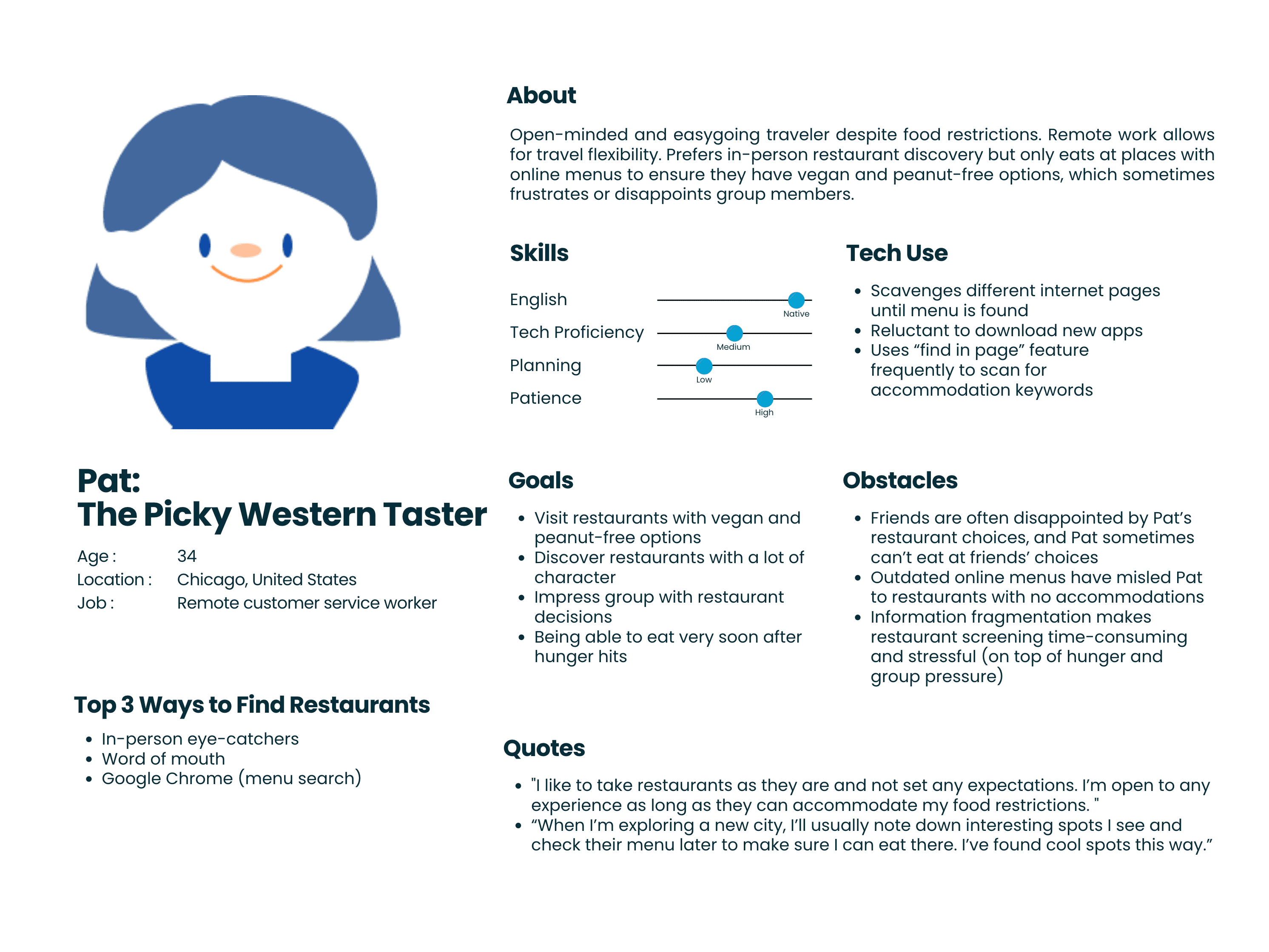
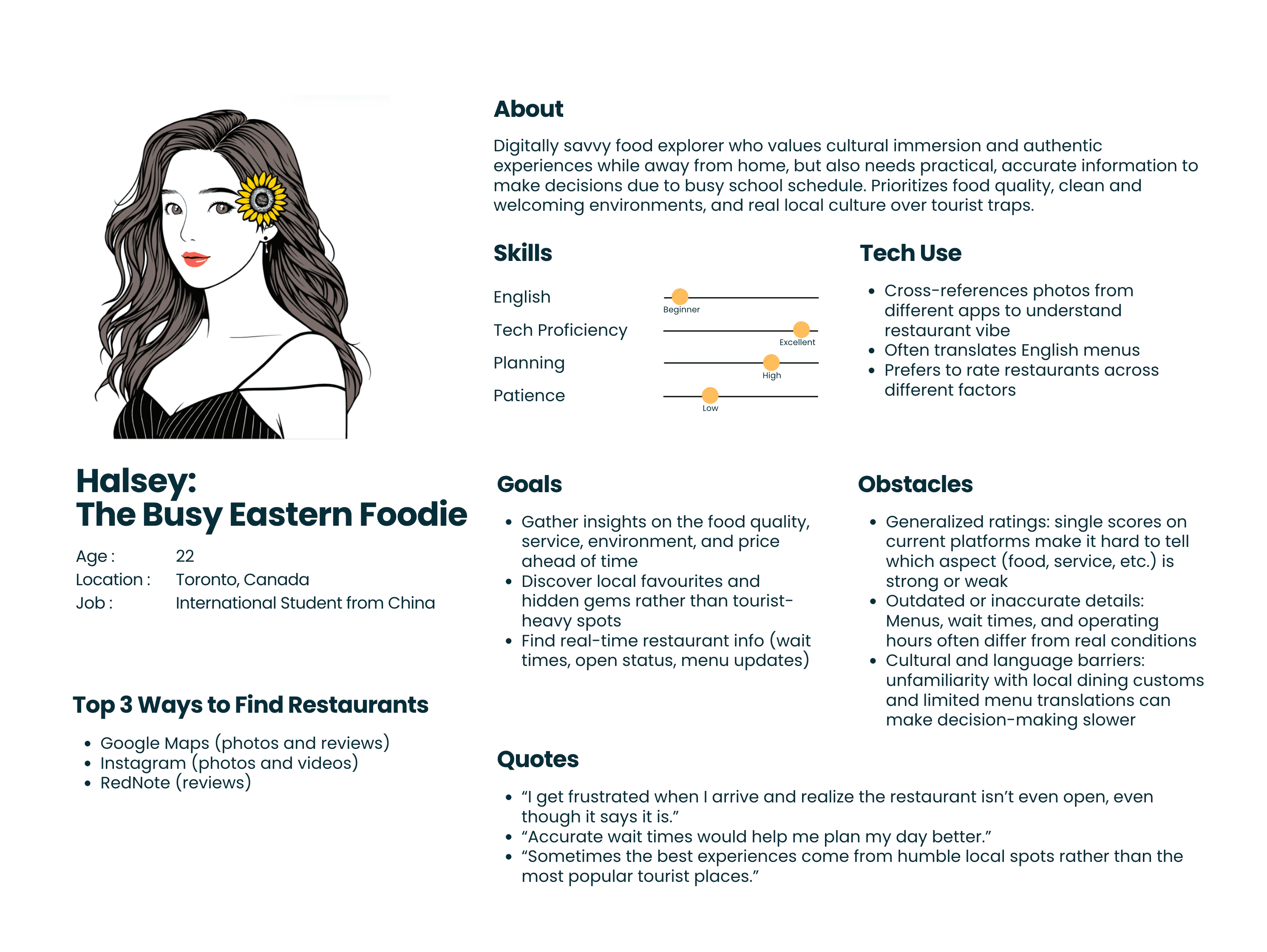
The takeaway People wanted to feel like they'd been somewhere before they walked in the door. So we focused on cultural connection and seeing the menu ahead of time.
Prototyping
So… what do we make?
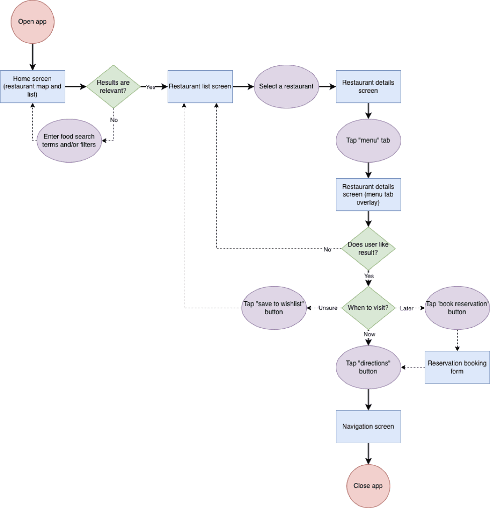
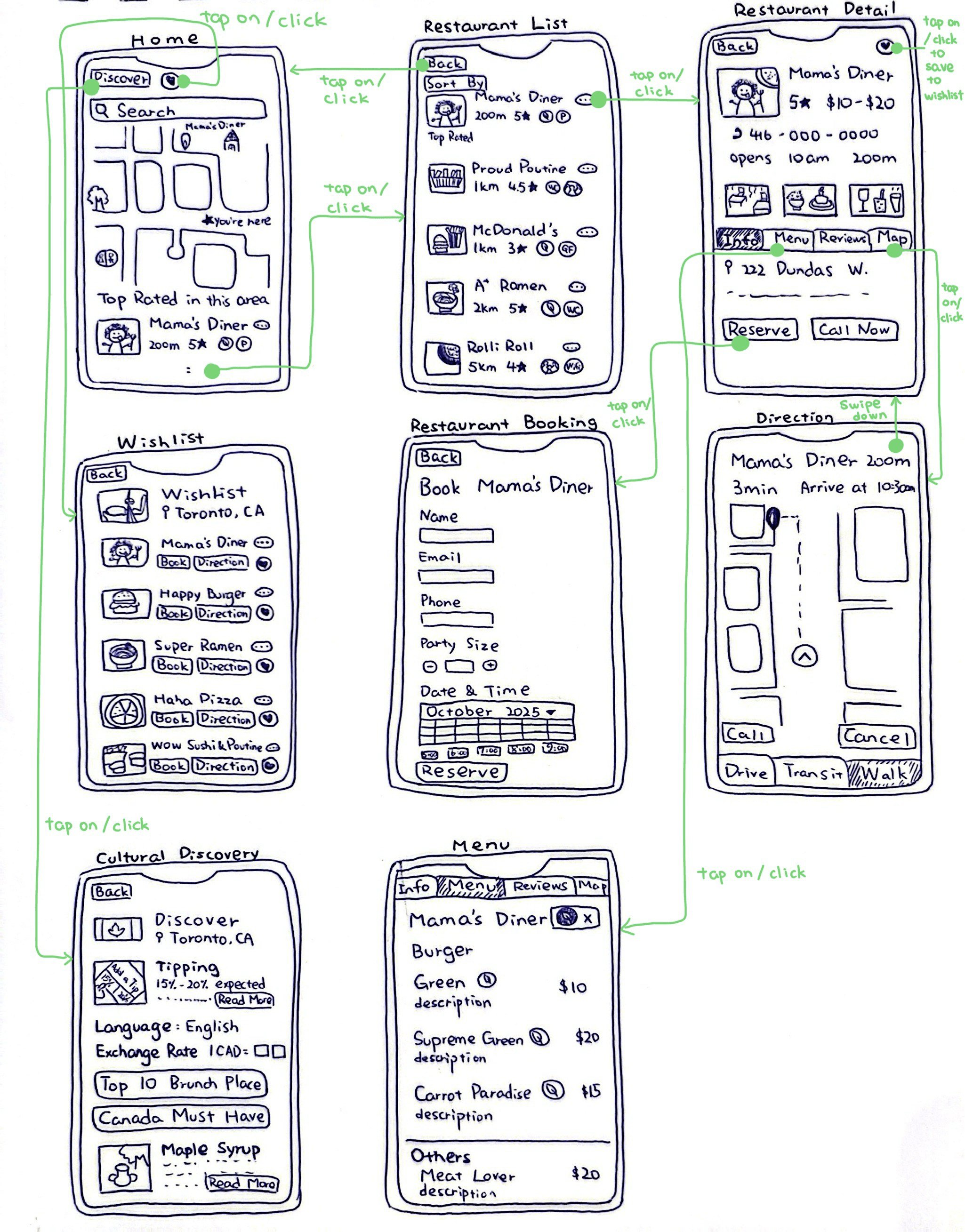
We got a little too excited about features, so I defined our main user path early to keep us focused. I built the main restaurant page for the wireframe: info, menu, and reviews.
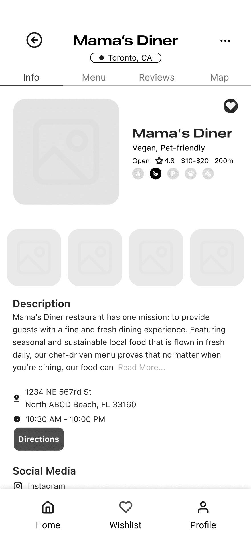
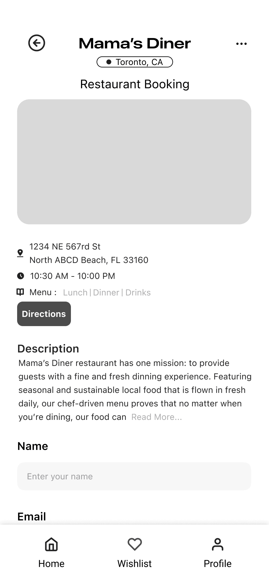
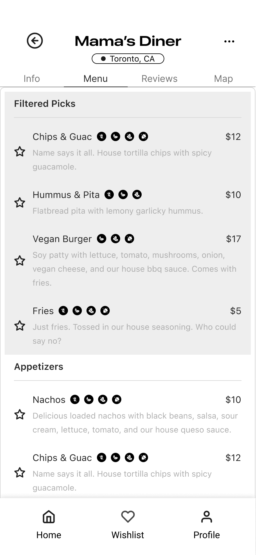
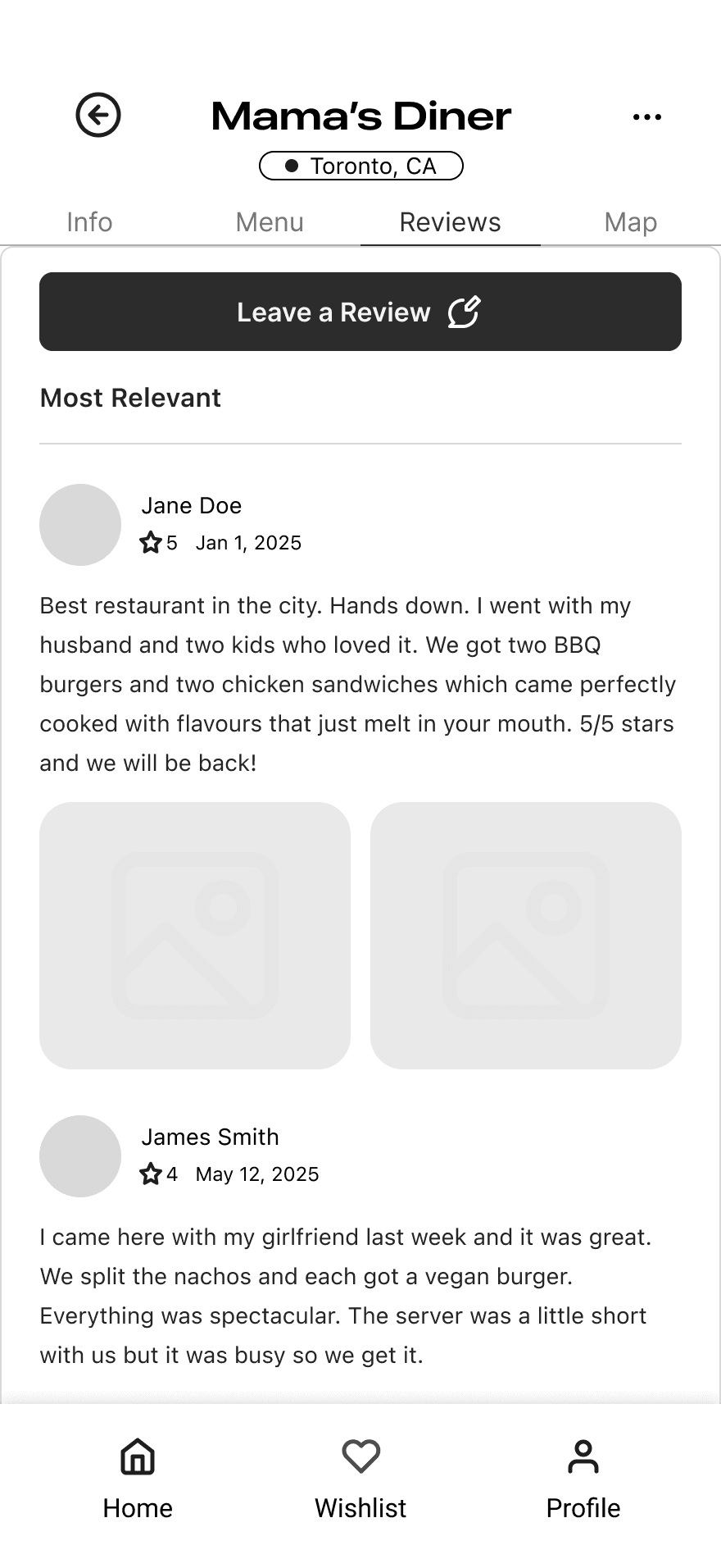
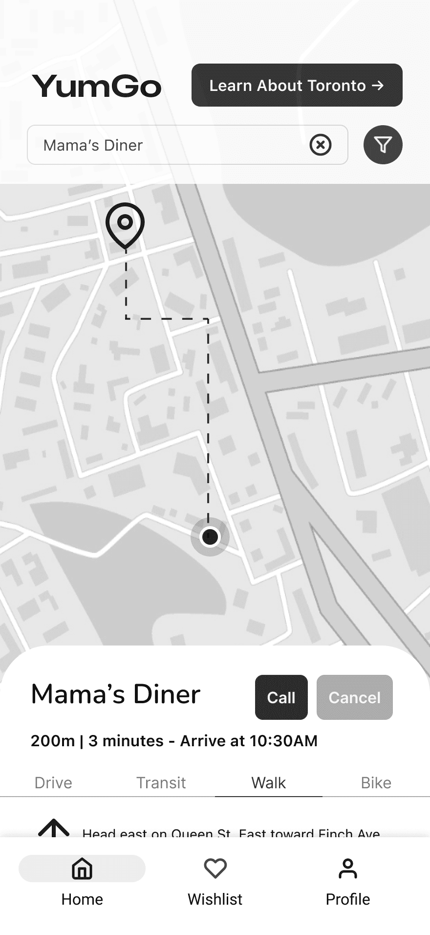
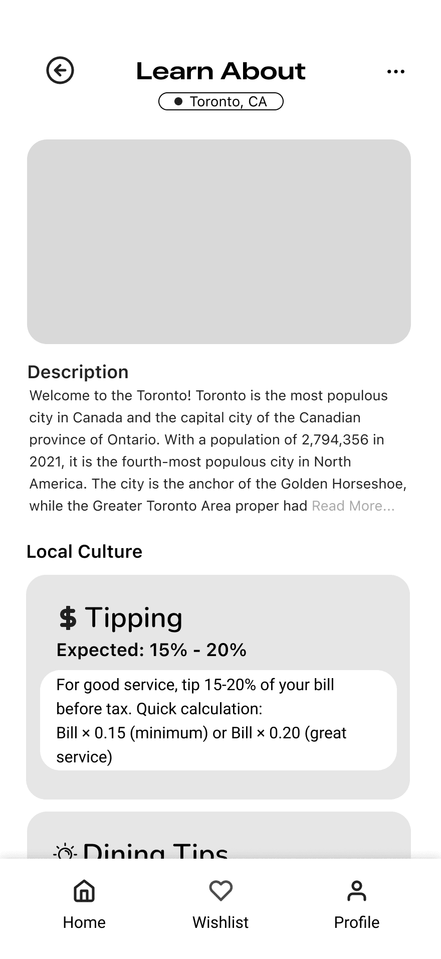
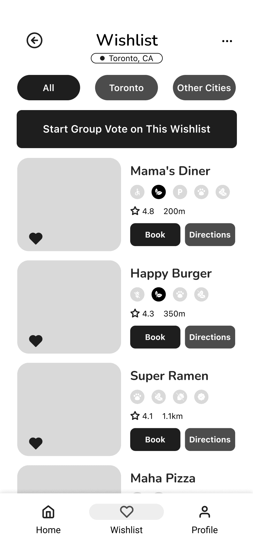
Our two rules
- Less is more! Fewer features, one complete journey
- Familiarity is the way Borrow from apps people already know
Testing
Clarity had to be improved… a lot
Eight participants tried two tasks in our Figma prototype:
- Book a table somewhere dog-friendly with vegan and gluten-free options
- Write a review afterwards
MAYDAY
After the first two interviews, I noticed that task 1 encouraged participants to use the search filters, but the toggle interactions were broken and users got stuck trying to make it work. OH NO!
I wanted to avoid unnecessary friction in future tests, and also wanted to make room for unique, novel, and valuable insights (instead of something I already knew). So, I scurried to solve this problem in the couple hours before the next user test.
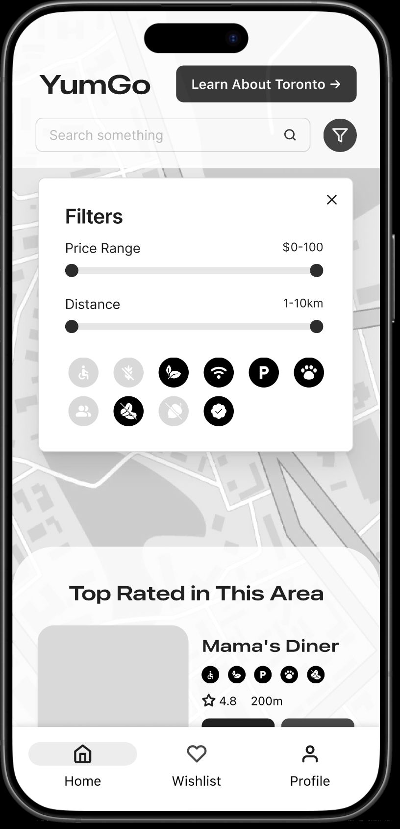
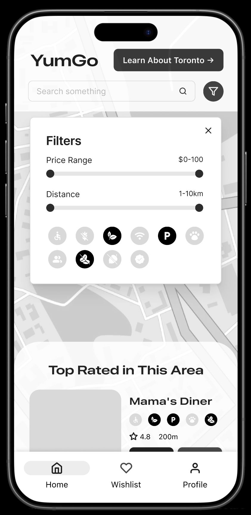
Left: the initial toggle, where not all filter buttons updated as expected. Right: icons are now properly selectable and deselectable, and their status is reflected in the restaurant list.
In the nick of time, I solved the problem and toggling now worked better than ever. Also, all future participants did indeed use this function, which made me feel like a superhero. Phew!
What we discovered
 !Filters were unclear People still didn't know what the icons meant
 !Key info was easy to miss Too much text buried what mattered
The fix · Labels for every icon
From tested to final
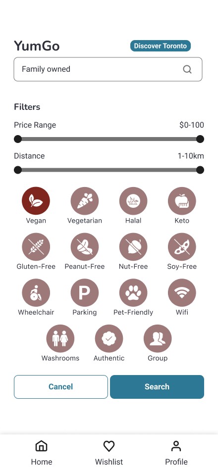
Participants didn't understand the icon-only filters, so every icon now has a label.
Reflection
What I learned
- Keeping four people's work feeling like one app Everyone used Figma and components a little differently, so there was a lot of reorganizing to do. I'm proudest that I could spot when we were drifting off course, rally the team, and get everyone's ideas flowing together, instead of ending up with a bunch of disjointed pieces.
- Moving in reverse is still moving Backpedalling (like on wait times) was hard, but I learned to hold ideas loosely and see pivots for what they REALLY are: improvements!